Why you need a custom Error 404 Page & how to set one up in Squarespace, with 15 creative examples
page not found?
If you’ve ever found a broken link, or clicked through an old viral Pin that no longer leads to anything, or misspelled some URL you heard on a podcast; then you’re familiar with the 404 error page.
And maybe you’ve noticed: there are two ways that experience can go.
Option A: You find yourself on a boring white page with small, generic text that clearly screams “this was a mistake.” You think to yourself ‘whoops that don’t look right’ and BOOM, back button, we’re outta here. Look familiar?
Then there’s Option B: You don’t find what you were looking for, but at least there’s something interesting to look at. There’s a clever message, some color, some branding, and actual content to browse. Now this isn’t your every-day 404 page. ‘Maybe I’ll stay and have a look around…’
Now Idk about you, but I’d say we should be giving our site visitors the Option B experience. Even if we misplaced an outdated URL, we’ve worked hard to get visitors to our website; we don’t want to lose them now!
So how do you create a more engaging error page just in case you wind up leading internet users down a broken path? Well Squarespace makes it easy! Man I love those guys...
replace the default error 404 page with your own in squarespace
First create the custom error page as you envision it
Create a new blank page in your Not Linked section and name it ‘Error 404’ or something of the like.
Then get to designing!
Be sure to be creative and make it visually interesting in some way.
In this day and age, when we see the standard error page, our brains immediately recognize that there’s nothing interesting there and we should leave. So basically… don’t make it look like an error page. 😆
Of course you can include a search bar to help them find what they were looking for & encourage them not to immediately hit the back button. But what else can you include to help them engage?
Allow your brand’s personality to come across in whatever way is authentic. Whether that means humor, attitude, joy, romance, or professionalism; just make sure the 404 page is consistent with the rest of your website.
Think about incorporating photos or even a gif if it makes sense!
Then offer some of your most popular pages or blog posts for them to check out.
Need to see some inspo? Check out the examples below. Otherwise, let’s finish setting up your new error page!
Set the page you created to be the official error page for your website
If you are using the latest version of Squarespace, 7.1, go to Website > scroll to the bottom and click “System Pages” > 404 Page.
On the older versions of Squarespace you’ll go to the main menu, Design > 404 Page.
In the dropdown menu, select the name of the page you just created.
Hit Save and it’s all set!
Bonus tip: Hide your error page from search results
If you don’t want this page to pop up in Google results (cuz that would be kinda awkward…), you’ll want to let Squarespace know that.
Hover over the 404 page you created in the Website or Pages panel, then click the settings gear icon that appears next to it.
In the popup window that comes up, head to the SEO tab.
Here you’ll see an option that says ‘Hide Page from Search Results’. Toggle that on and Save.
vóila!
15 creative custom error page examples for your inspiration
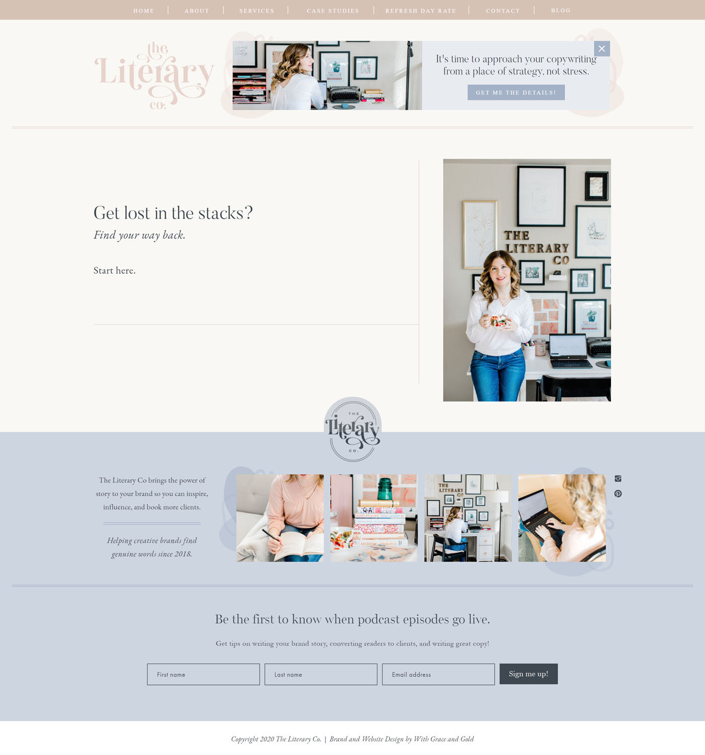
1. The Literary Co.
2. Magnolia
3. David’s Bridal
4. Martha Stewart
5. Sacks Productions
6. Paige Brunton
7. Kayla Hollatz
8. Brides
9. Erika Fitzgerald
10. Brush Creek Ranch
11. The Knot
12. Melyssa Griffin
13. Amy Porterfield
14. Wild Spirit Co.
15. Wellness Site Shop
Once you’ve created your new fancy error page, drop a link in the comments below! I’d love nothing more than to cheer you on! 🙌


