Portfolio: Inspiring Squarespace website for a mental health author & speaker
The client: Morra Aarons-Mele, The Anxious Achiever
When Morra approached me to work together on her website, she already had a successful podcast, a published book and another on the way, her very own TED talk (yeah… she’s that cool) and tons of other impressive speaking credentials.
Her topic of expertise? Understanding your mental health so that you can thrive as a leader.
Morra’s suuuper passionate about turning your anxiety into a tool that you can leverage and learn from in the workplace. She’s become affectionately known in professional circles as “The Anxious Achiever”.
What we needed to do was highlight all this awesome knowledge Morra has and make her look like the trustworthy expert she is, so that she could promote her [at the time] upcoming book and continue to become known as an industry leader!
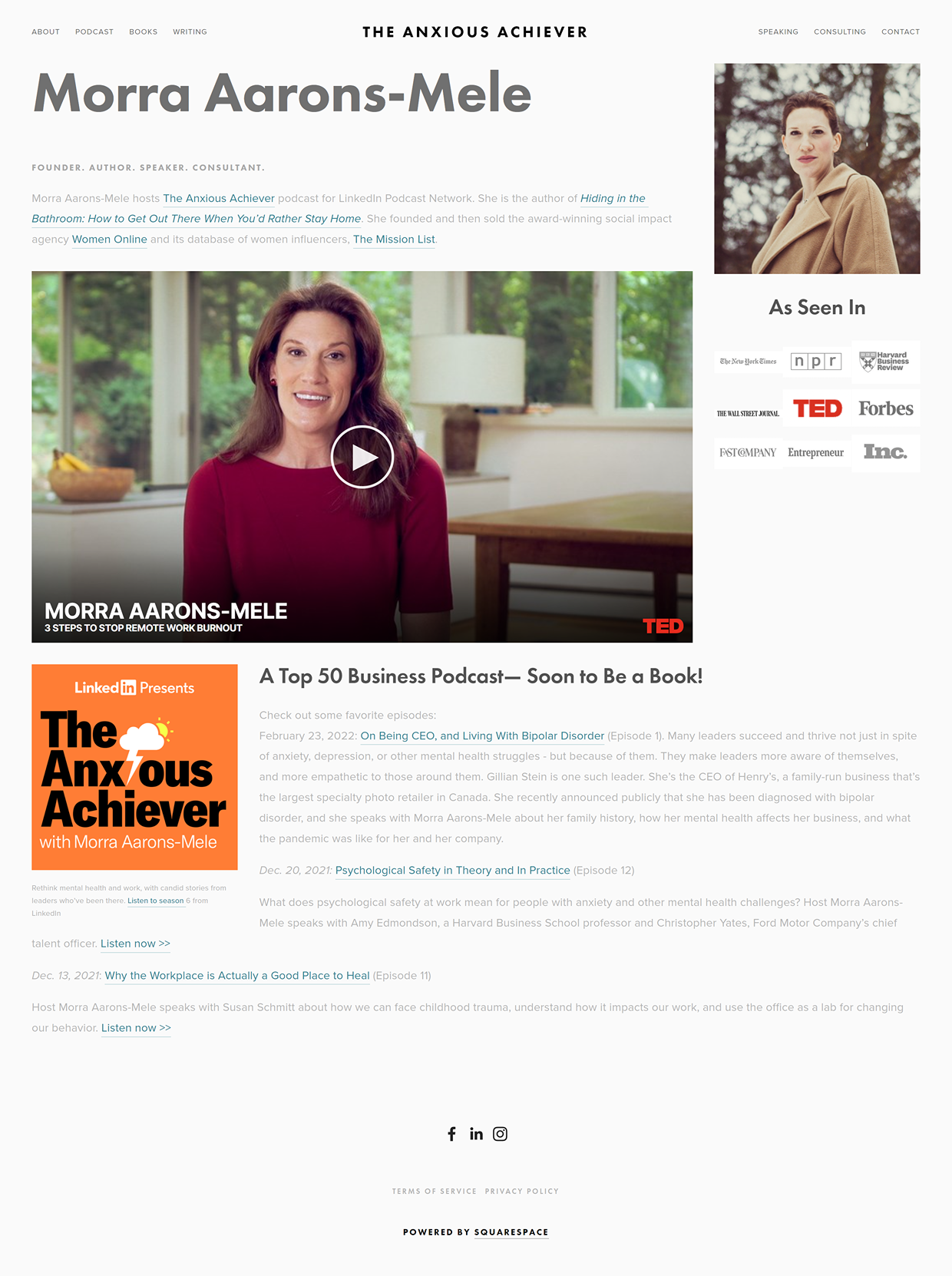
Here’s what Morra’s website looked like before the redesign:
The goal: a multi-faceted website to showcase her speaking & sell books
Morra’s old website had become a bit of a hodge-podge over time with press features, awards, video clips, and resources. It was time to transform all of these tools & accomplishments into a structured, cohesive website that would not only be easy to navigate, but enjoyable to peruse.
We knew the design scheme needed to feel soothing (aka the opposite of anxiety), but still energetic in that it inspires you to take action. We also wanted the website to have an air of clean sophistication, like Swedish modern interiors or LinkedIn itself (with which Morra is closely tied).
With that in mind, I chose tranquil colors like soft grey and blue as background, while mixing in some high contrast white and dark teal for a bit of traditional corporate appeal. But to bring back in some of Morra’s joy and warmth, I also added wood-tone accents and orange calls-to-action (her signature color).
Here is the mood board we created to drive the website design:
The solution: A custom website strategy & Squarespace site
The structure of the website needed to be very intentional, since Morra has a variety of resources and content channels; and because we were catering to two different audiences:
1) those looking to book Morra for speaking engagements and consulting,
and 2) the consumers following along.
We designed a layout that allows the visitor to easily find whatever it is they’re looking for, while encouraging them to take some kind of action. This helps the visitor feel like they’re being taken care of, while strengthening Morra’s connection to her audience!
For example, on the Home page, we provide all the highlights of what Morra has to offer.
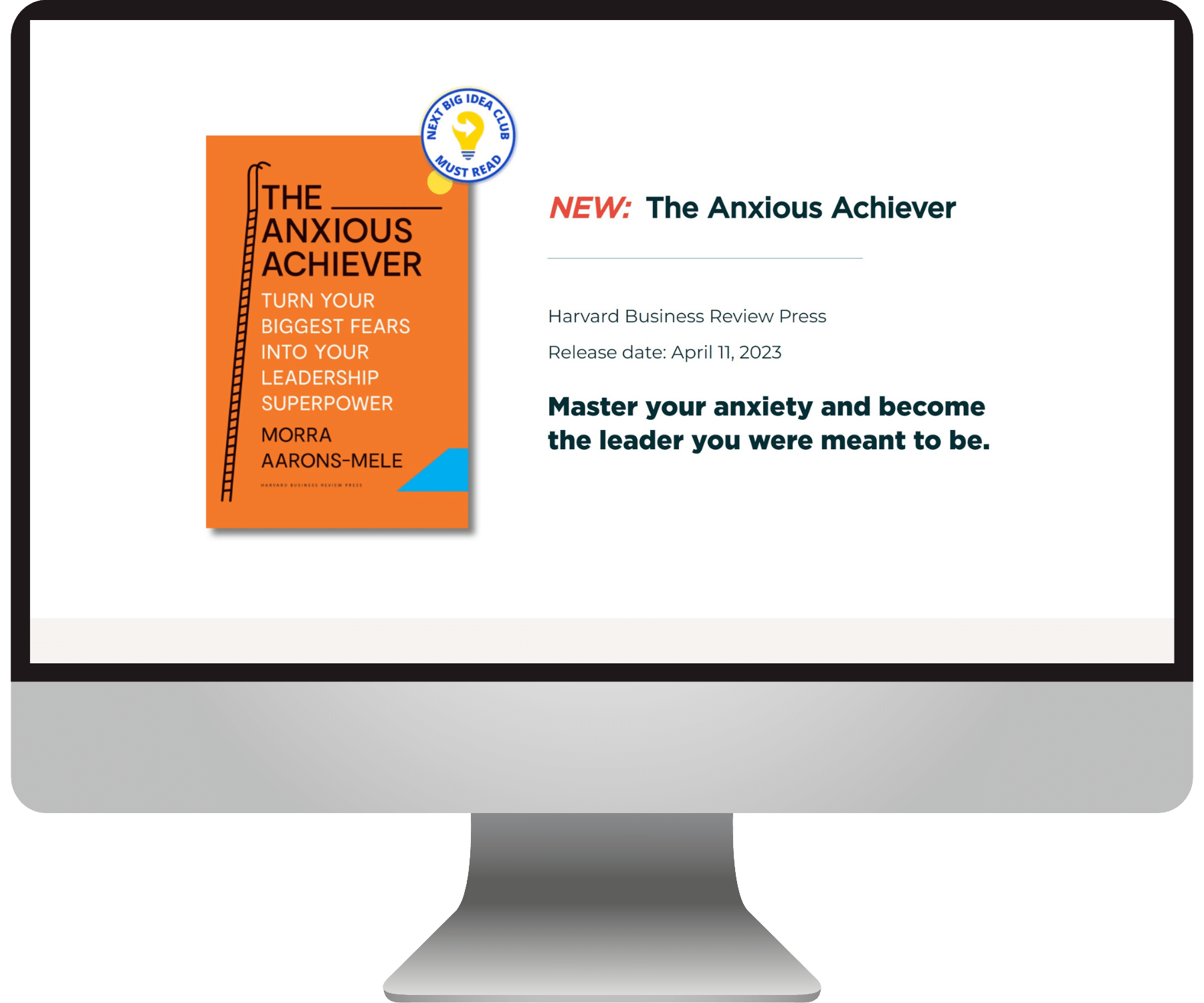
If someone is interested in the Anxious Achiever Podcast, we also let them know that the Anxious Achiever is now a book, and redirect them to the Books page.
If someone is interested in the Blog, we offer them the chance to subscribe to the newsletter for updates.
And so on :)
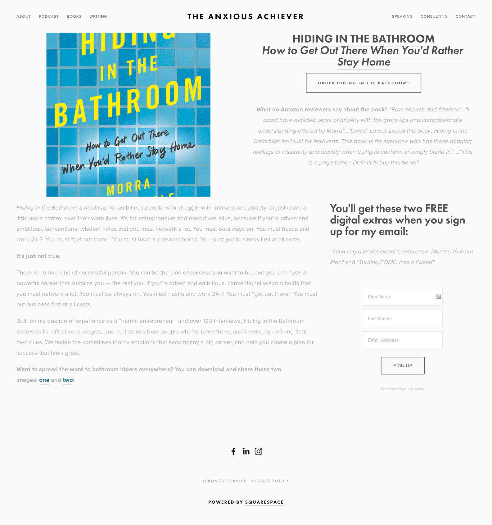
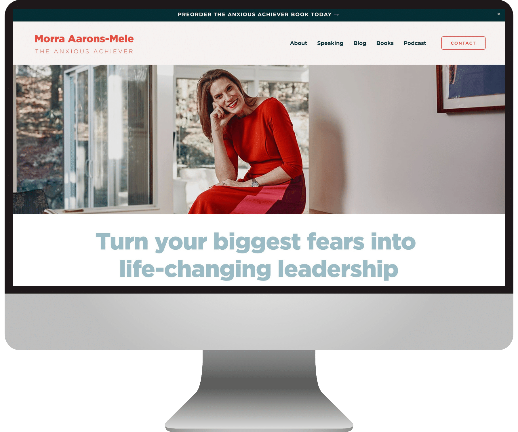
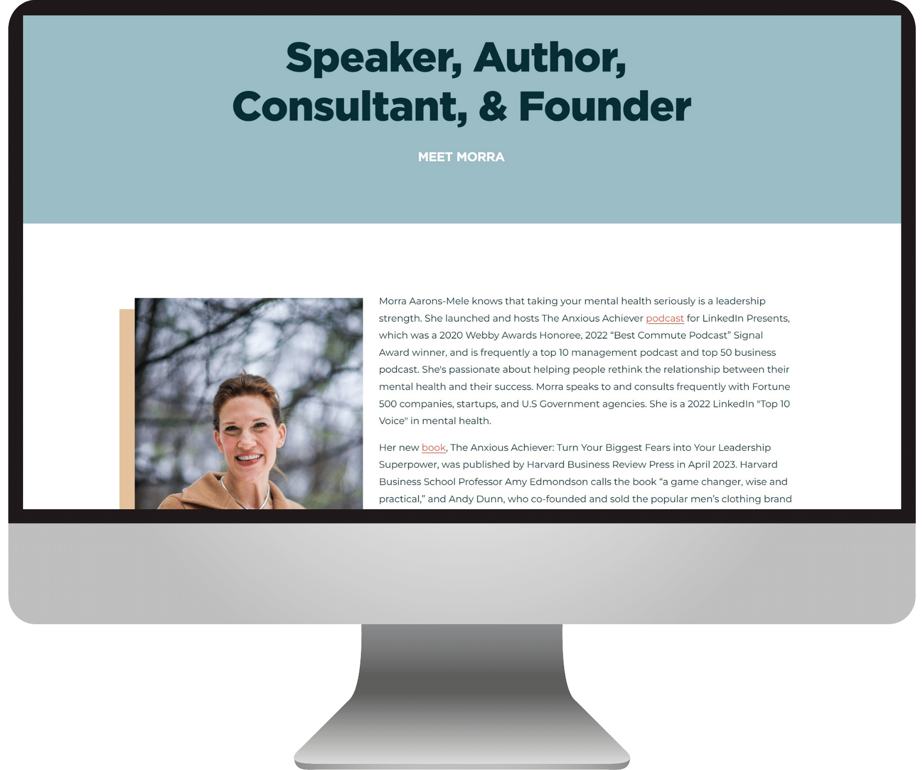
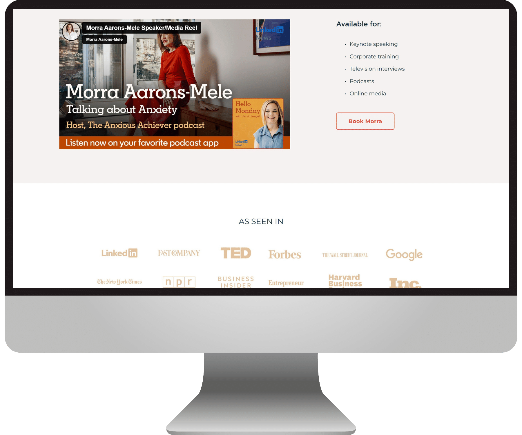
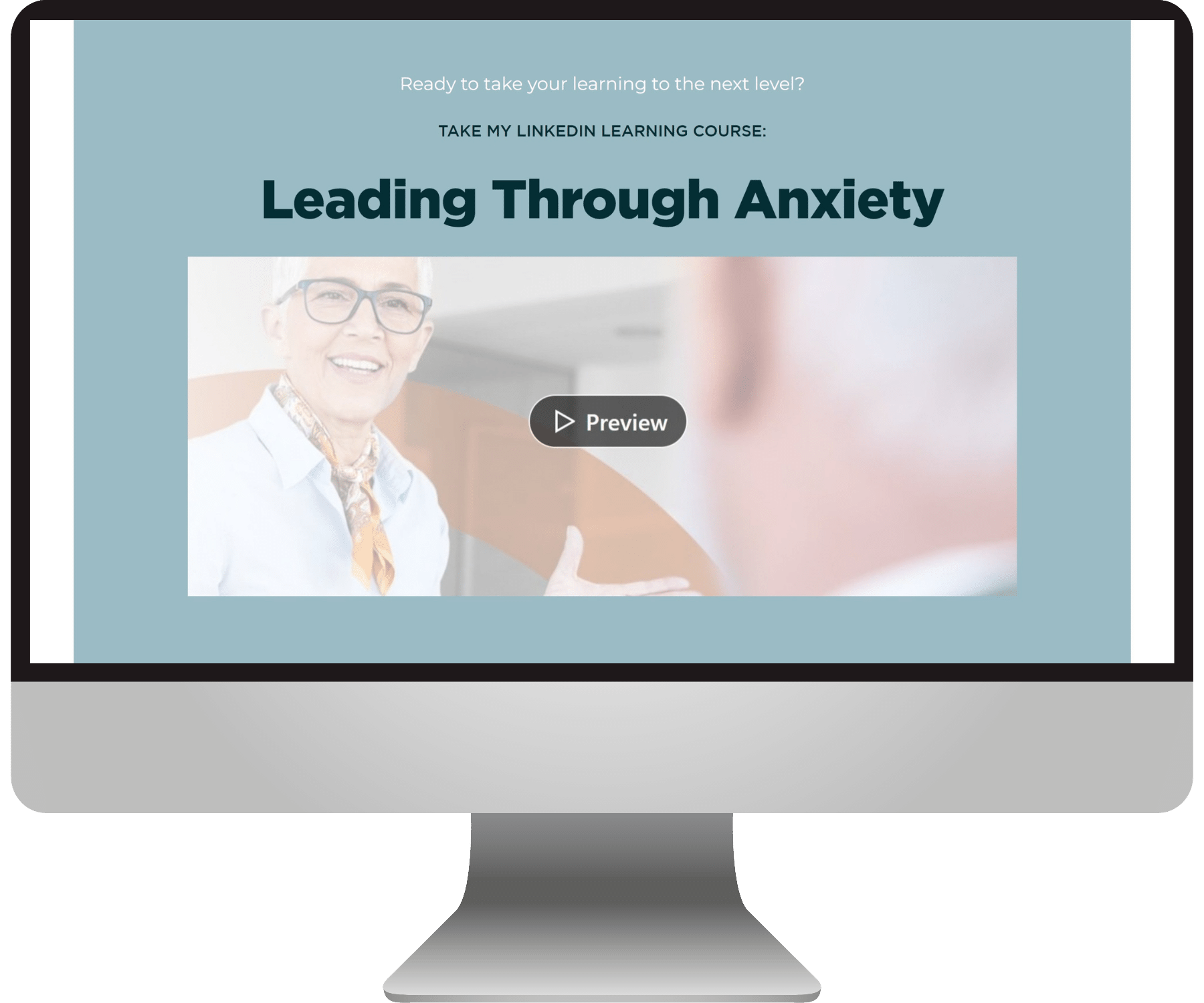
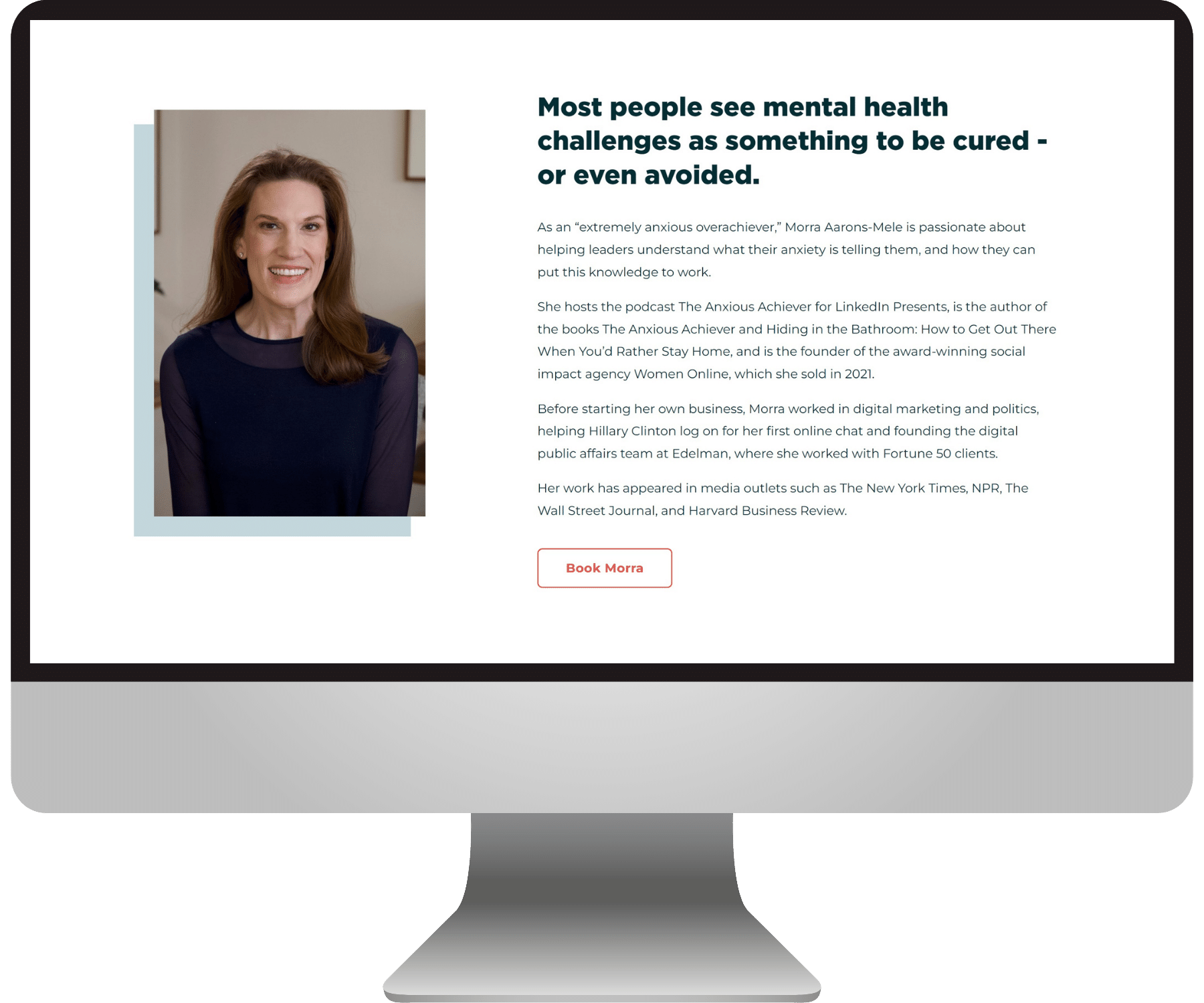
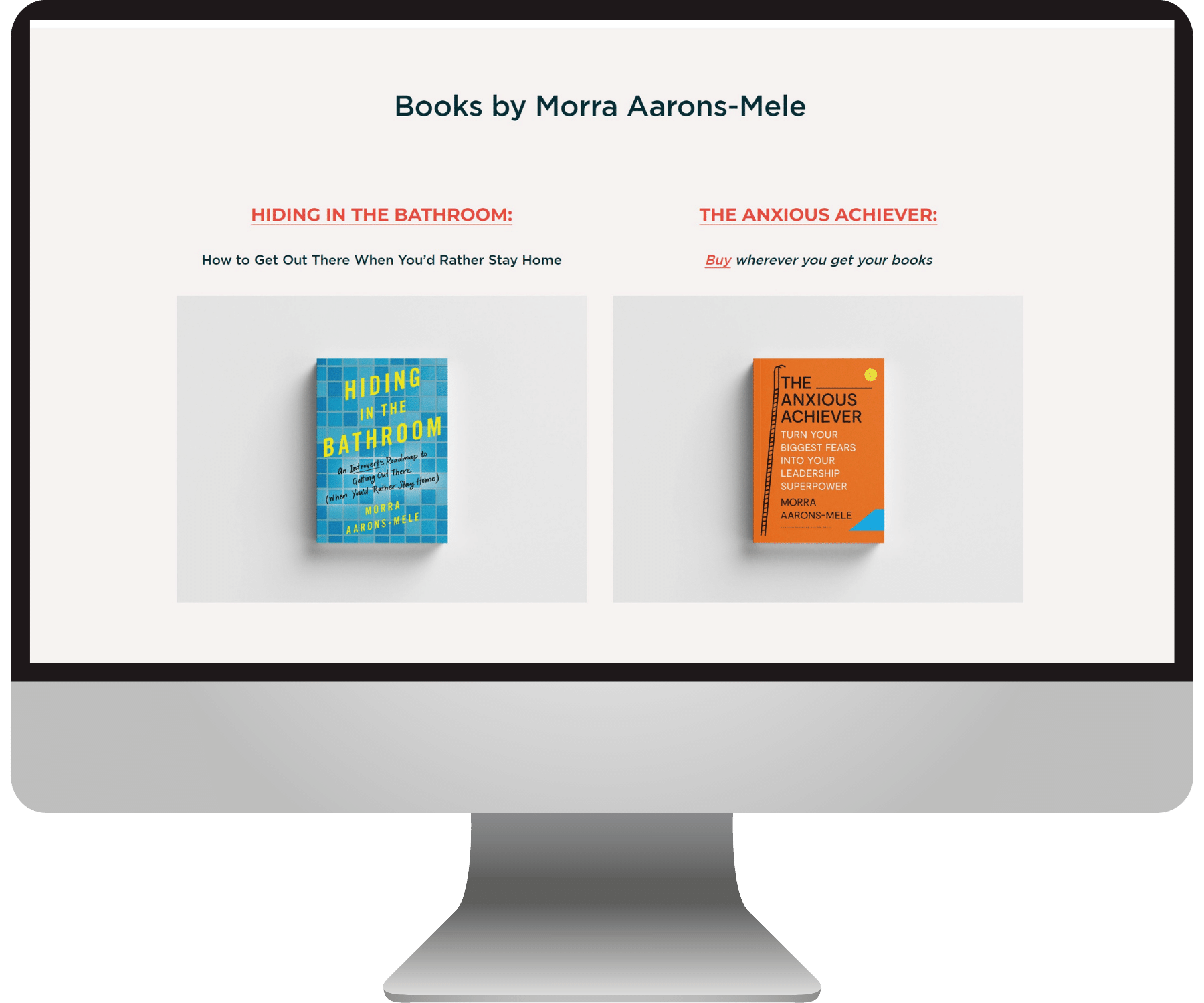
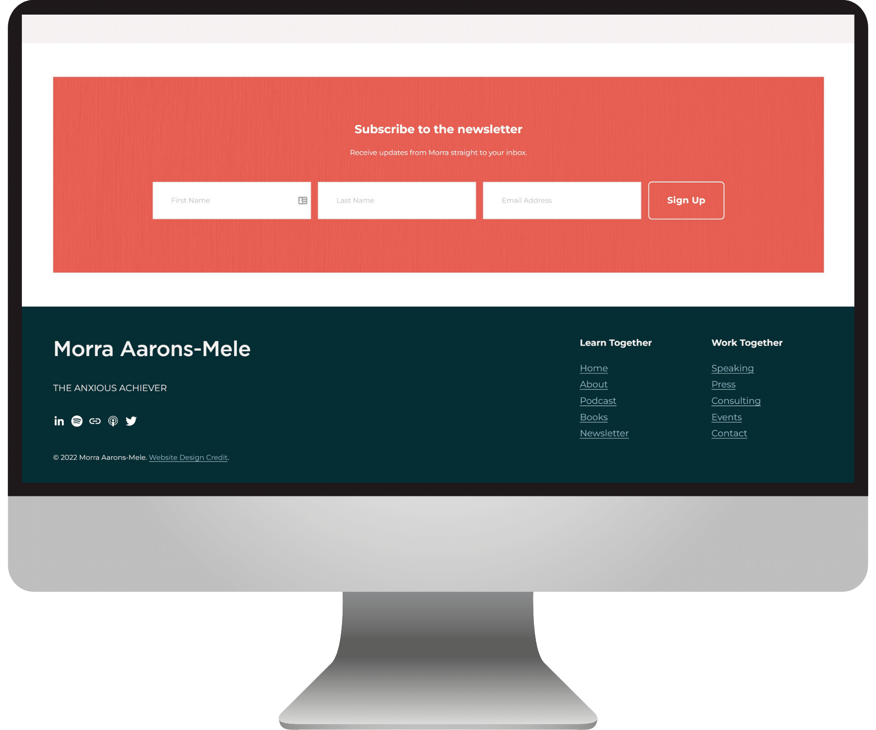
Take a look-see at the website we created for Morra:
You can check out some of Morra’s amazing content here:
“I love my new website!”
“From start to finish Emily offered a really thoughtful, super-organized, and helpful process to get my website to a fabulous new place.”
— Morra Aarons-Mele, The Anxious Achiever
Check out more BEJ web designs here:

