Photoshop tutorial: How to make a website banner out of a small photo
(P.S. You DON’T have to be a Photoshop expert to follow this tutorial - but you DO need to have Photoshop available.)
- Click here to skip ahead to the video tutorial -
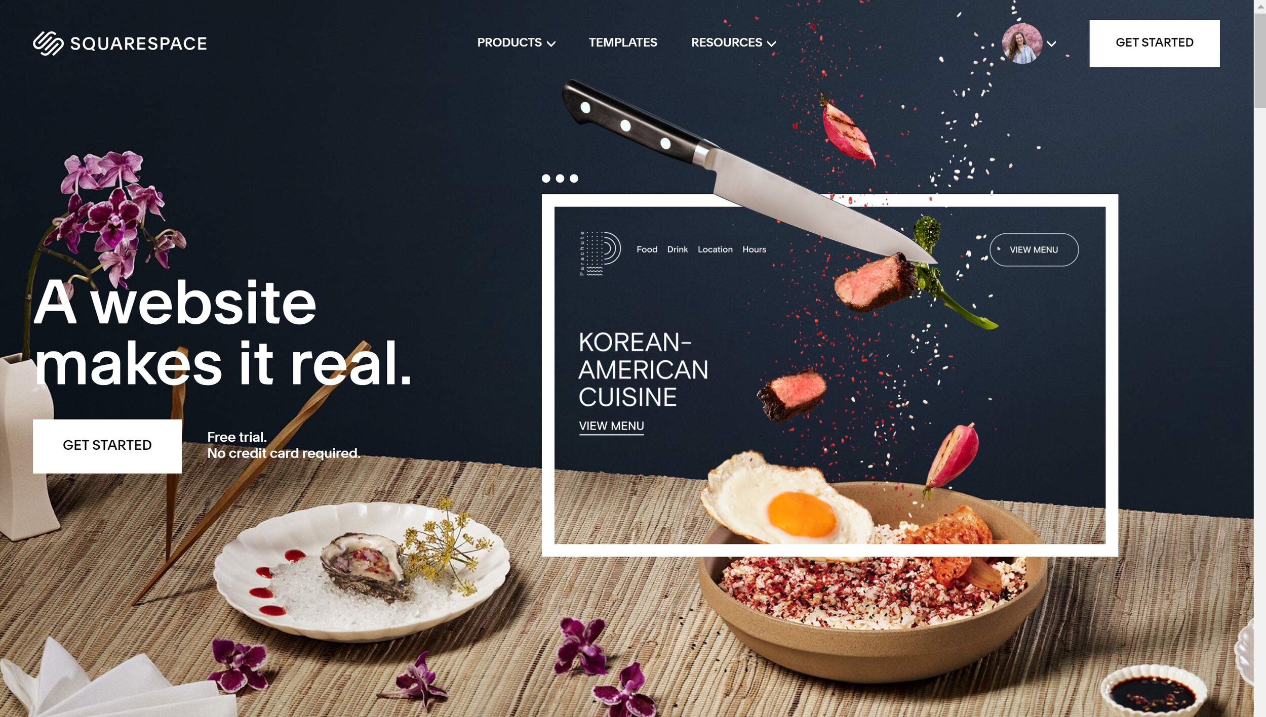
Squarespace makes it really easy to create hero/header/banner images with headlines on top.
a.k.a. those big, beautiful, even full-screen photos at the top of your website.
We see this layout practically EVERYWHERE online, and why?? Because it can play a vital part in keeping visitors engaged.
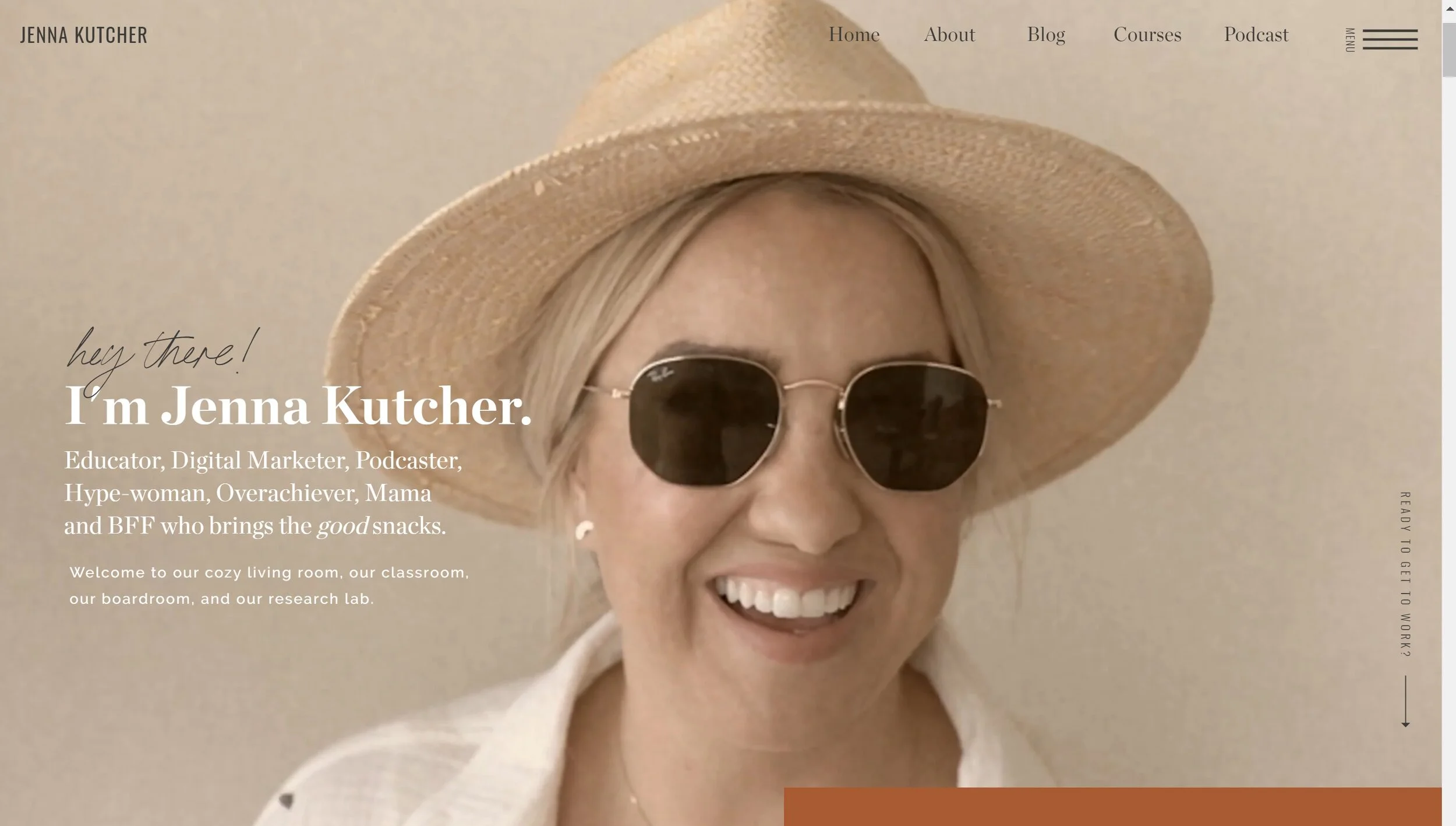
Take a look at these big brands that use this formula on their own websites:
When someone lands on our website, we have 0.05 seconds on average to help them decide if they’re gonna stay on our site, or bounce off to another one.
This means right when a visitor sees your home page, without having to scroll down, they should be able to tell what you’re offering and whether or not it’s relevant to them.
When you can implement a good headline as part of your strategy, it helps keep the right people on your website for a longer period of time.
- which tells Google that your site is bueno 👍, which gets you higher on the list of search engine results, which brings in more visitors, and the cycle continues! 🙂
One-half of that equation is having the right words (here’s a great resource from Ashlyn Carter if you want to dive deeper into headline-writing.) The other half, though, is picking a photo that will support and display your headline beautifully and legibly.
When you upload a photo as a background for a section of your website, Squarespace will fill the whole banner area with the image you choose. It takes the width of your photo and stretches it to be the full width of your site.
So you need a wide photo for a hero image, otherwise your square or portrait-orientation picture will become freakishly zoomed in and just not cute.
The problem is - many of us don’t have a bunch of wide-shot, landscape-orientation pictures with plenty of negative space to work with.
- nor the time or money to plan a whole new photoshoot right away.
It’s a problem I’ve run into both with my photos and my client’s photos, so I want to share the solution that I came up with. That’s where this tutorial comes in.
You can totally repurpose your close-cropped and even vertical pictures that you love, and put them to use for your banners!
This is basically a Tim Gunn “make it work!” moment.
We love a crafty queen.
here are some before & after examples of what you can create using a bit of Photoshop trickery.
Watch the video tutorial to see the method in action! The steps are also written below the video.
Step 1: After adding your photo to PS, duplicate the background layer and name the new layer “Wide Crop” or “Extend Frame” or something similar.
Step 2: Using the Crop tool, extend the frame to your desired size. Check “Content-aware” at the top and hit Enter on your keyboard.
Step 3: Duplicate the top-most layer and name it “Clone Stamp” or “Retouch” or whatever makes sense to you.
Step 4: Remove any blemishes in any part of the photo that will be visible in the final product, using the Clone Stamp tool.
Step 5: Create a Solid Color adjustment layer and choose your color preference.
Step 6: Click on the WHITE rectangle on the Color Fill layer. Then create your customized color fade-out over the photo using the Gradient tool.
Voilà! your masterpiece is complete.
I’d love to see how you give your photos new life! Be sure and link your work below so I can check it out! 😊

