Portfolio: Vintage website design for a husband & wife photography team
The Client
We Are The Richards
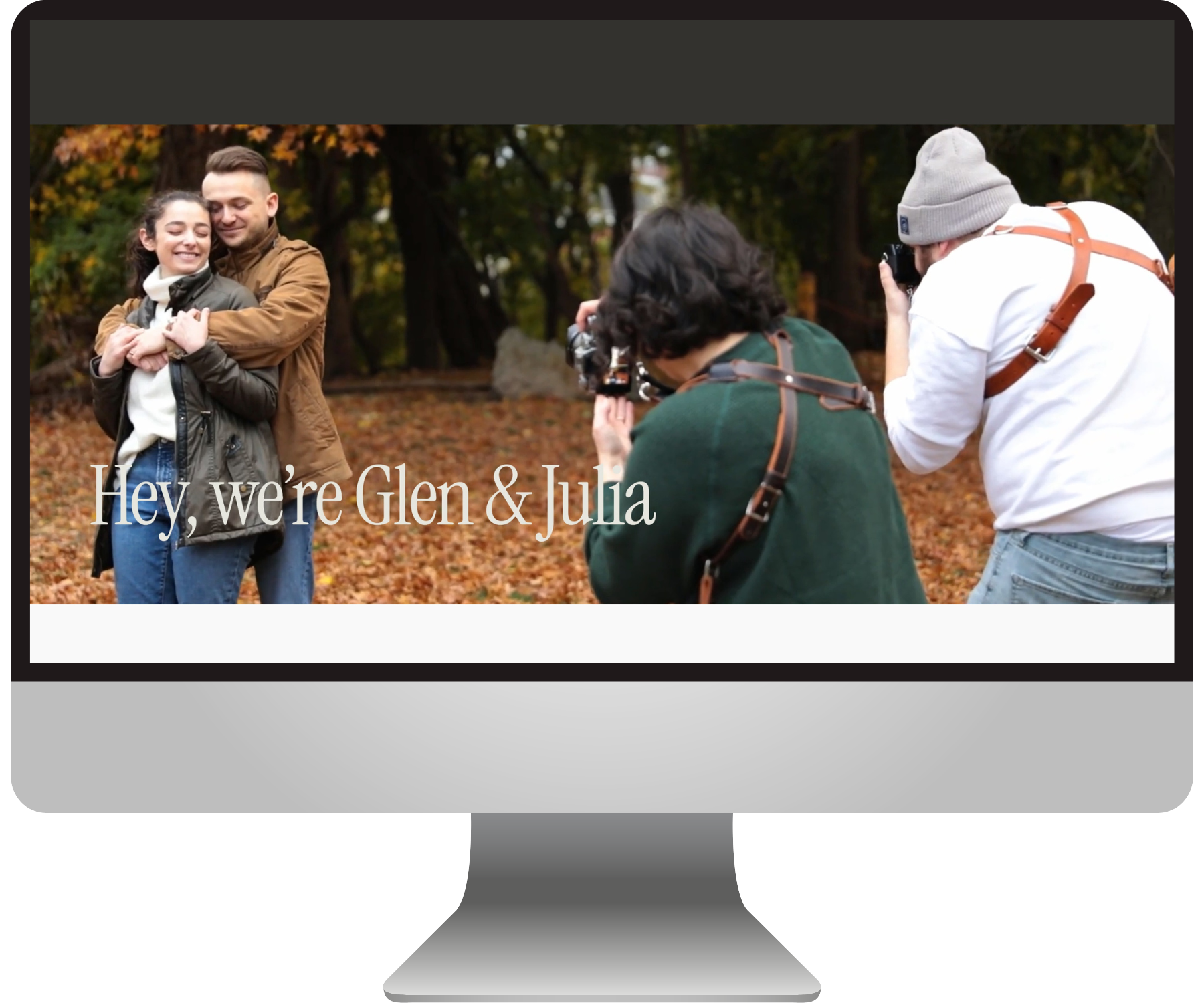
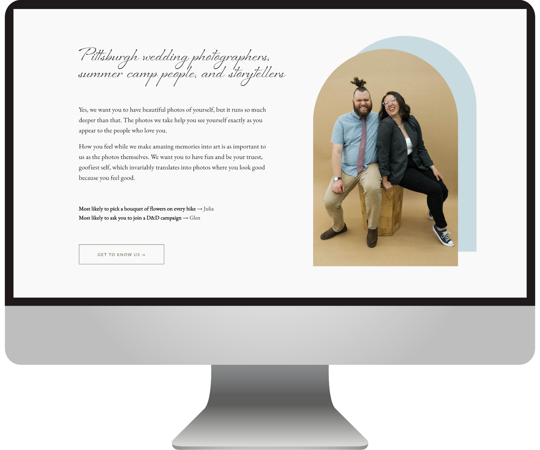
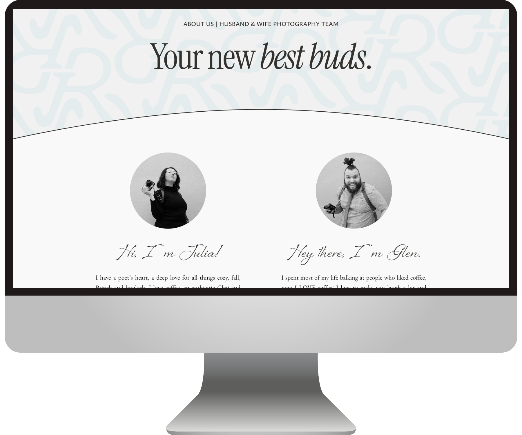
Let me introduce you to the fabulous photography husband and wife duo, Glen & Julia Richards!
Operating out of Pittsburgh, they are without a doubt the most warm & fun couple you could choose to take your wedding, family, or brand photos.
Everyone says they strive for authenticity and inclusivity, but what strikes me about these guys is that it actually SHOWS in their work and in how they carry themselves.
You won’t find perfectly-posed and tidy images of the Richards or their clients on their site, because they capture humans as they truly are. Amazingly & imperfectly beautiful!
When the Richards came to us, they felt like they had outgrown their old DIY website. It was time to bravely showcase their values and attract more aligned clients which shared those values.
Branding by Emily Foster Creative
The Game Plan
Ingredients of an effective website
We started our process with a bit of consulting to really understand what Glen and Julia cared about and what exactly they wanted to accomplish. As a team effort, it was our goal to make this website as irresistible to their kind of people. That meant all the pieces needed to work together to tell the same story.
Emily Foster Creative took some key words that described the We Are The Richards brand aspirations, like “honest, storytelling, timeless, loving” and creatively crafted a new brand identity to embody them. (See the brand board above for a taste!)
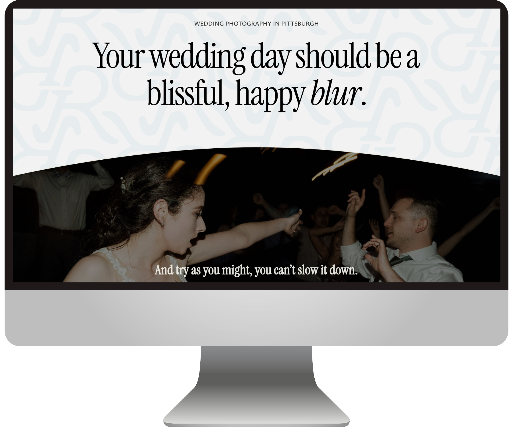
Then, Andrea Shah wrote brilliant copy that cut right through the noise and spoke directly to the hearts of the Richards’ ideal clients: People of all backgrounds who cherish real moments over pretty pictures.
Then it was my task to marry everything together on a brand new Squarespace website!
The Squarespace Website
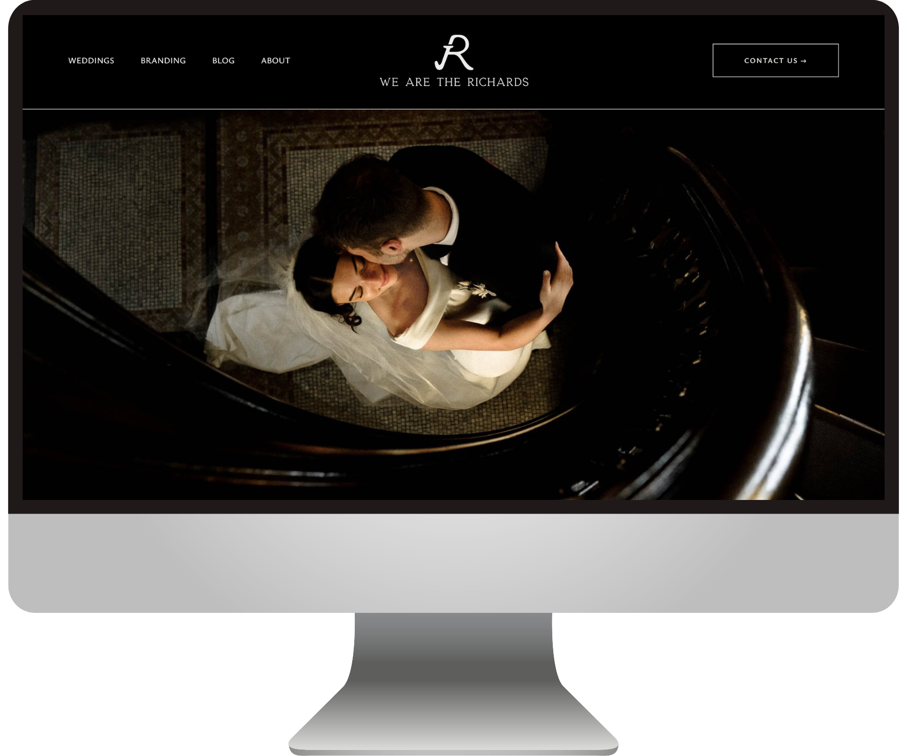
An honest & timeless design
First, we migrated everything over to the new version of Squarespace to help the site feel more modern and give us better design capability!
We made sure to strategically highlight all of the Richards’ offers without it feeling overwhelming. That way whether you’re getting married, you’re building a business, or you’ve just had a baby, you know where to go.
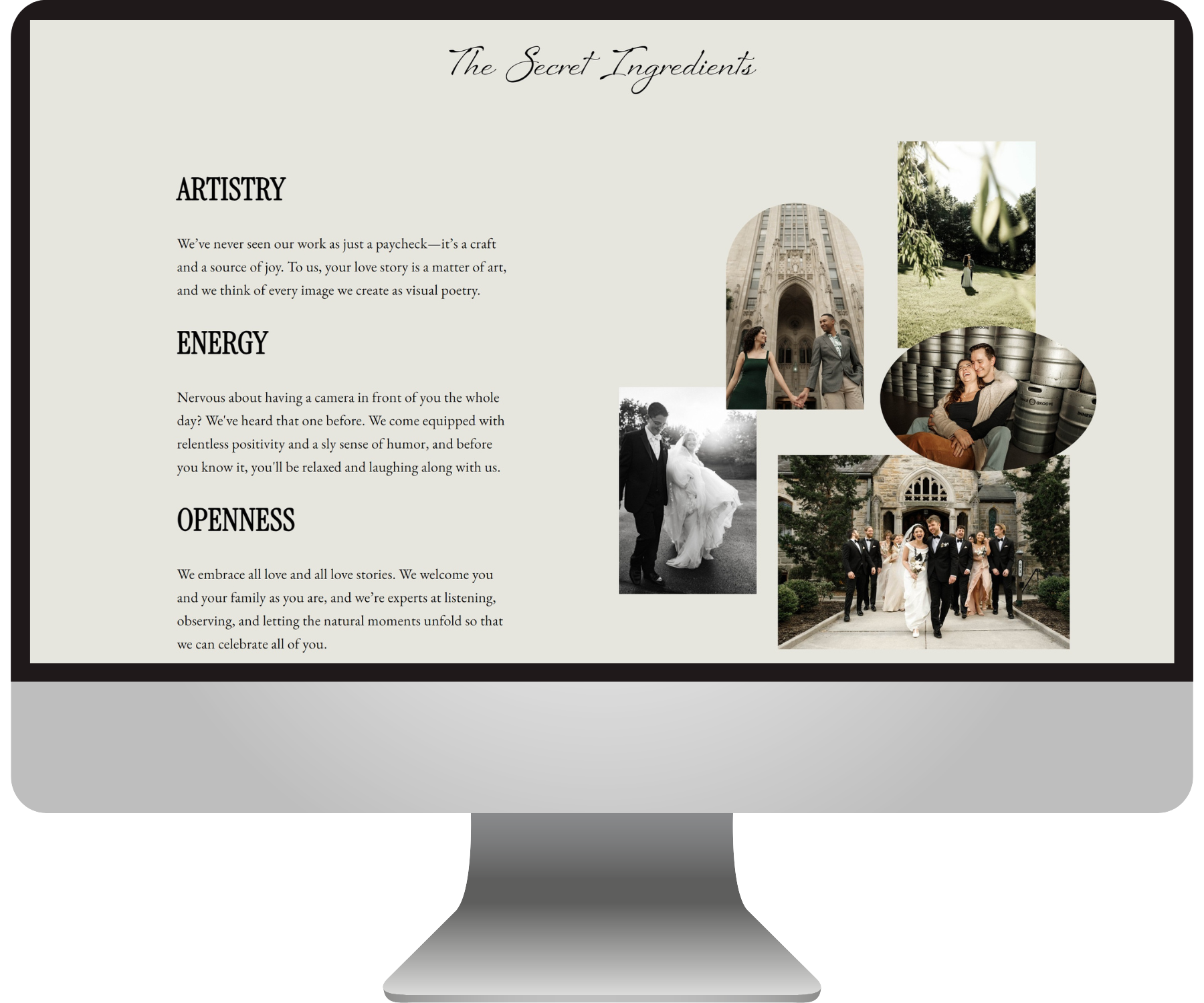
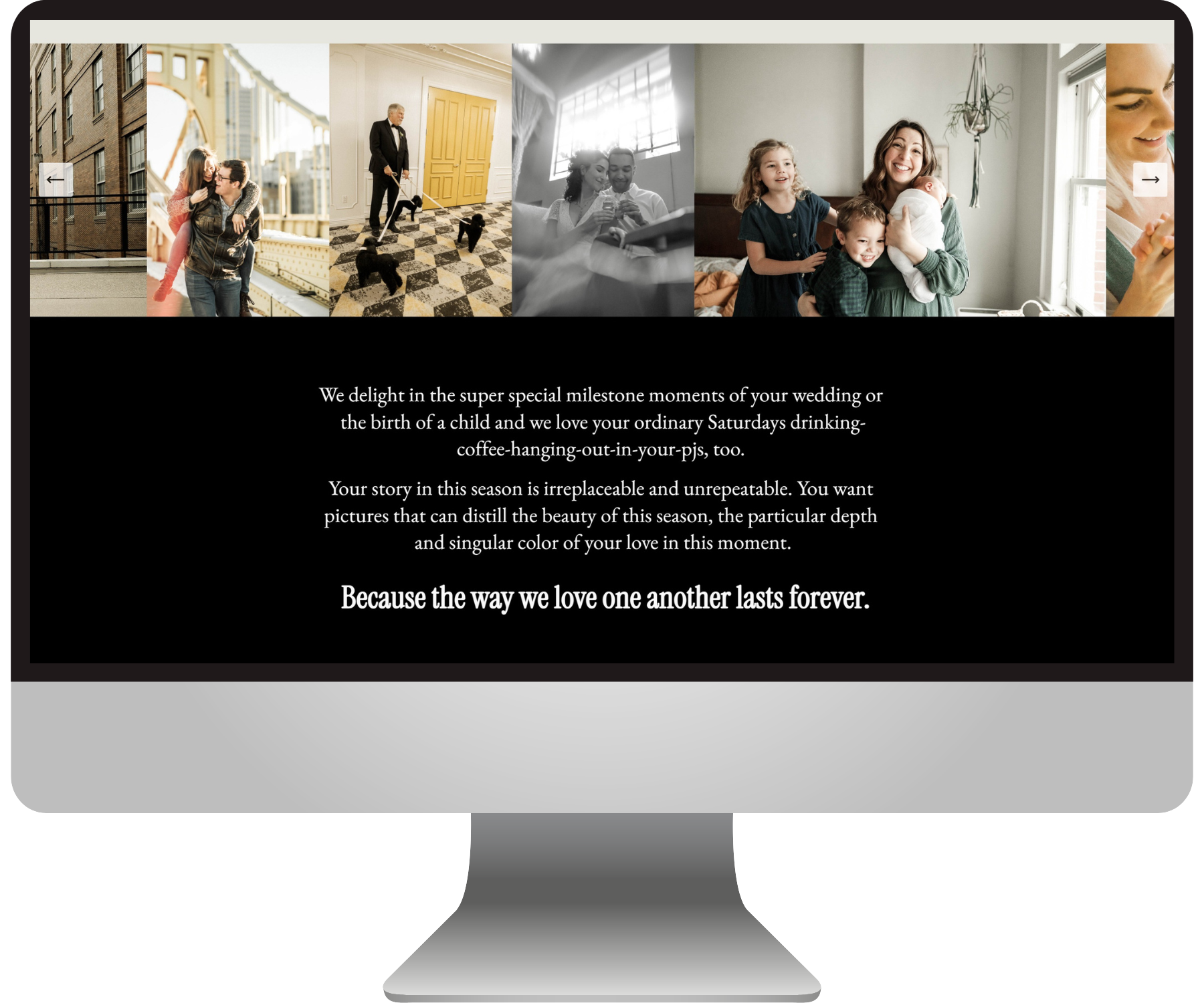
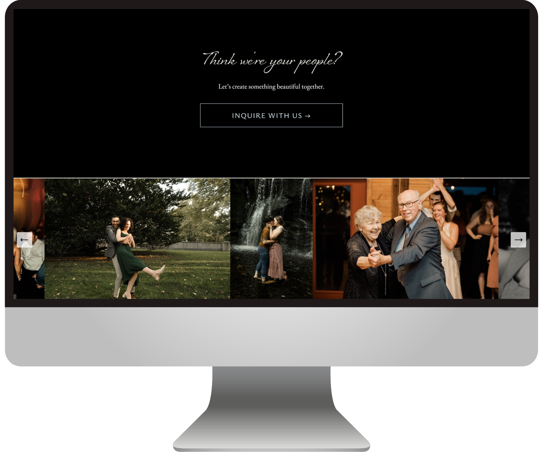
It was really important to me to select the right images to pair well with Andrea’s copy for each section. We specifically chose photos from their portfolio that showcased people of all ages, races, and orientations in moments of real emotion.
Just like the unorthodox quality of their work, we wanted to have a sense of playfulness in the design, which we achieved through alternating dark and light colors and a variety of font styles.
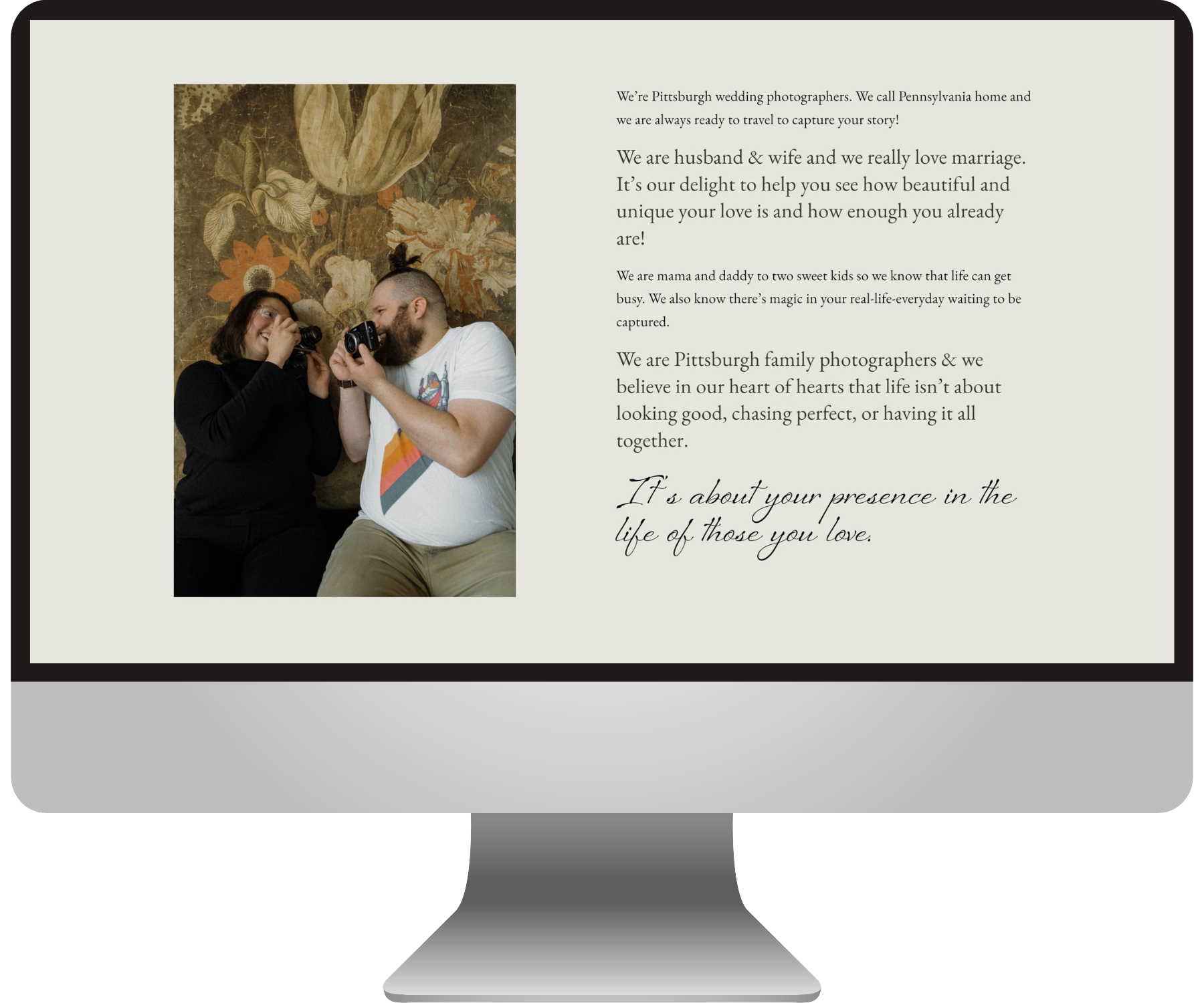
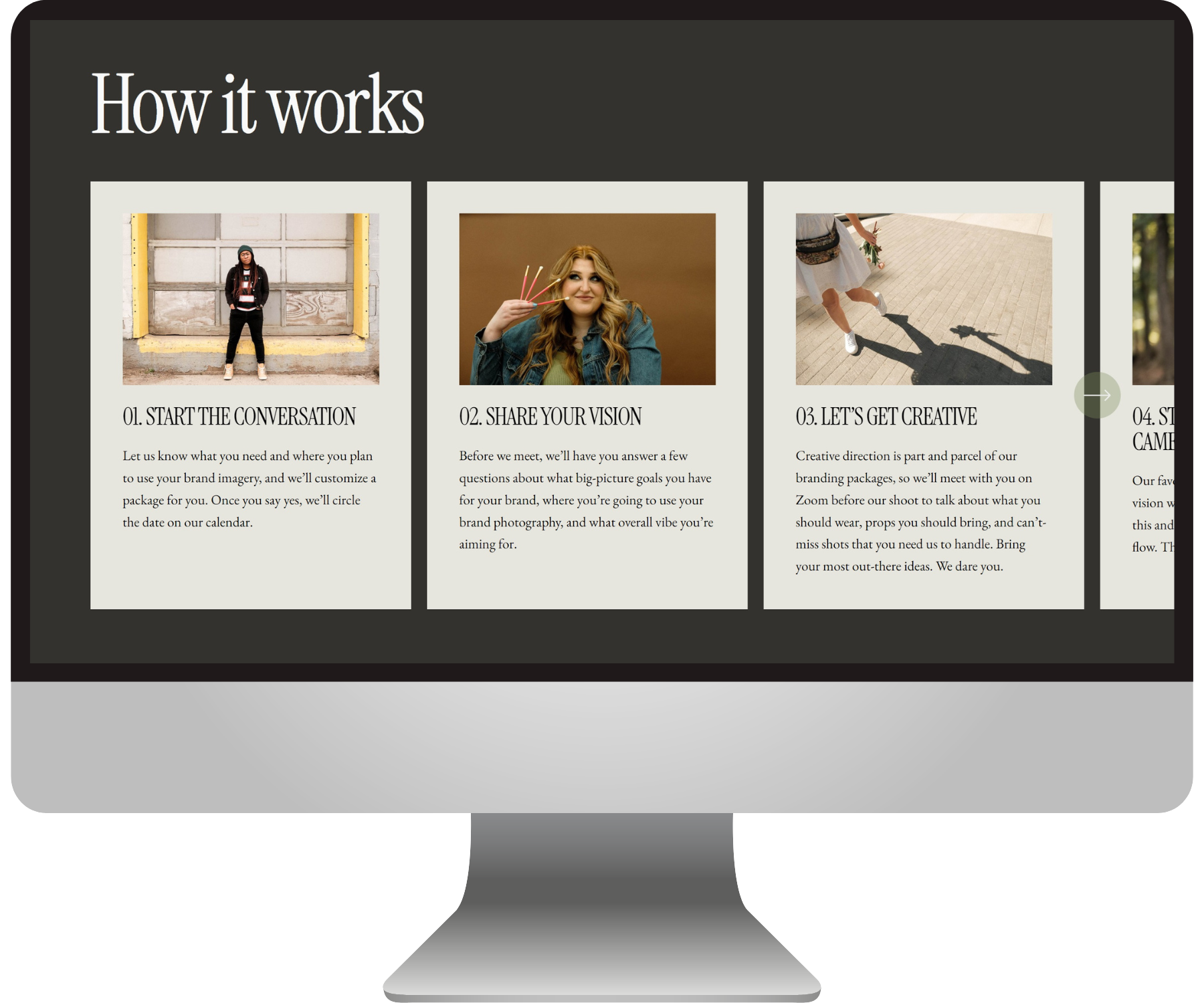
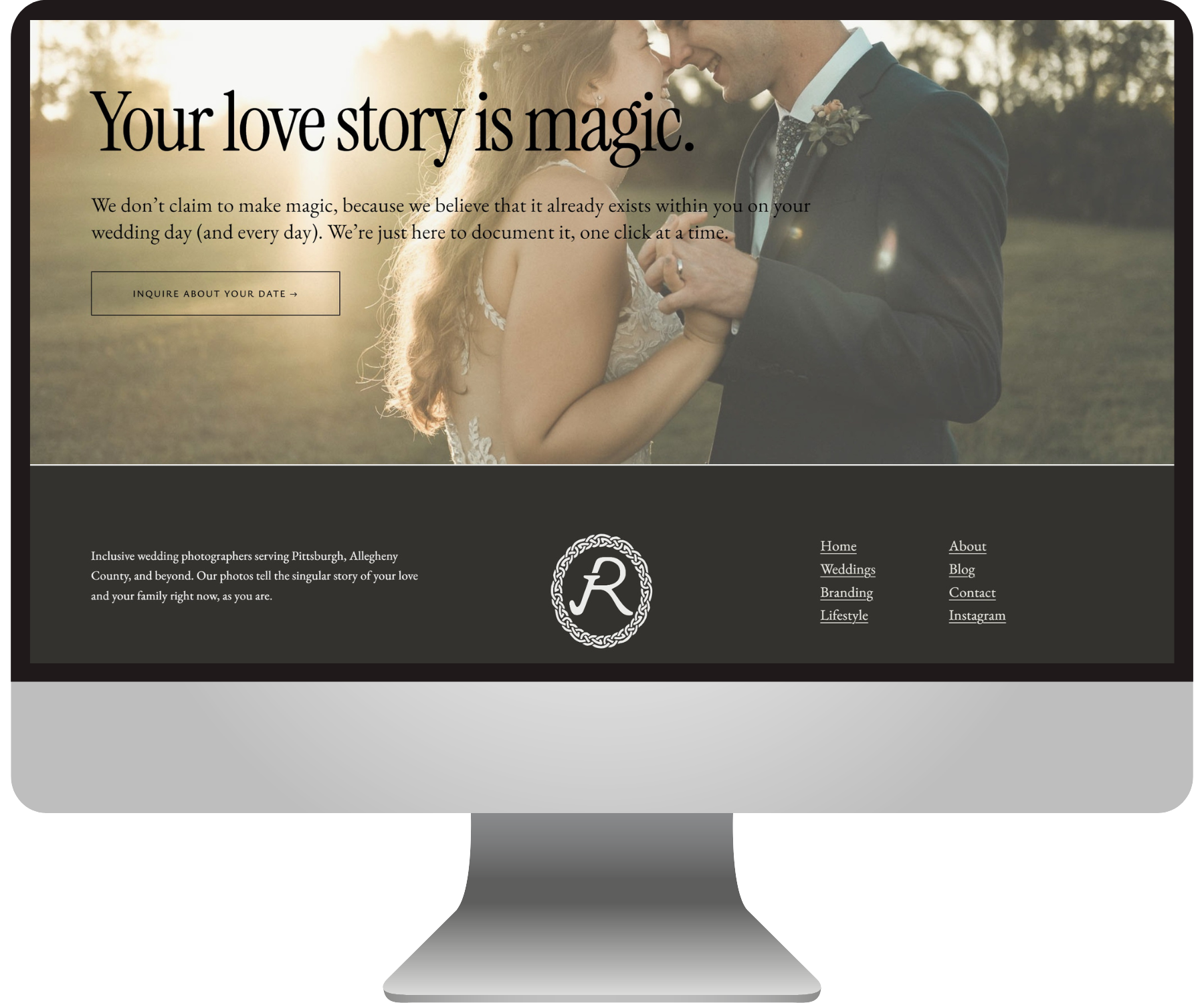
Check out some close-ups of the design!
The Richards had the absolute KINDEST stuff to say about their experience & their website! <3
“It felt like you really got US - you took our nebulous ideas and our vibe and turned our website into a magical, amazingly beautiful, clear and elevated design that feels SO good!!!
We feel like our vision and our whole presence comes across more authentically to who we are, and also making us look super cool, badass and awesome! We are SO thrilled, delighted, entranced with the design of our site - it just ROCKS. And we never thought we could feel that way about our website. Not only is Emily incredibly talented and knowledgeable about her area of expertise - she is an absolute gem to worth with. We truly felt so taken care of, so seen and supported by her, as business owners but even more so just as human beings.”
— Julia & Glen Richards
Check out more BEJ web designs here:


