Portfolio: Wedding videographer website design with rich earth tones
The Client
Hans Film & Photo
Let me introduce you to my client, Hannah, owner of a wedding videography & photography company. (And her work is literally some of the most amazing I’ve seen in the DFW area.)
We met when I spoke at the North Dallas Wedding Vendors Association, and I immediately felt drawn to her warm & calm aura!
When we later connected about her website, it was clear that Hannah had already worked super hard building up her skills and portfolio, and now needed to upgrade her website to match her level of expertise.
Ultimately, her goal was to attract engaged couples in the luxury wedding market.
I noticed her current website at the time had some issues that were probably turning some clients off:
The color scheme was muddy & lacked contrast
Arched-photo overkill
No variation in fonts
Crowded content & messy layouts
I knew these were problems we could solve so that Hans Film & Photo could appear more high-end!
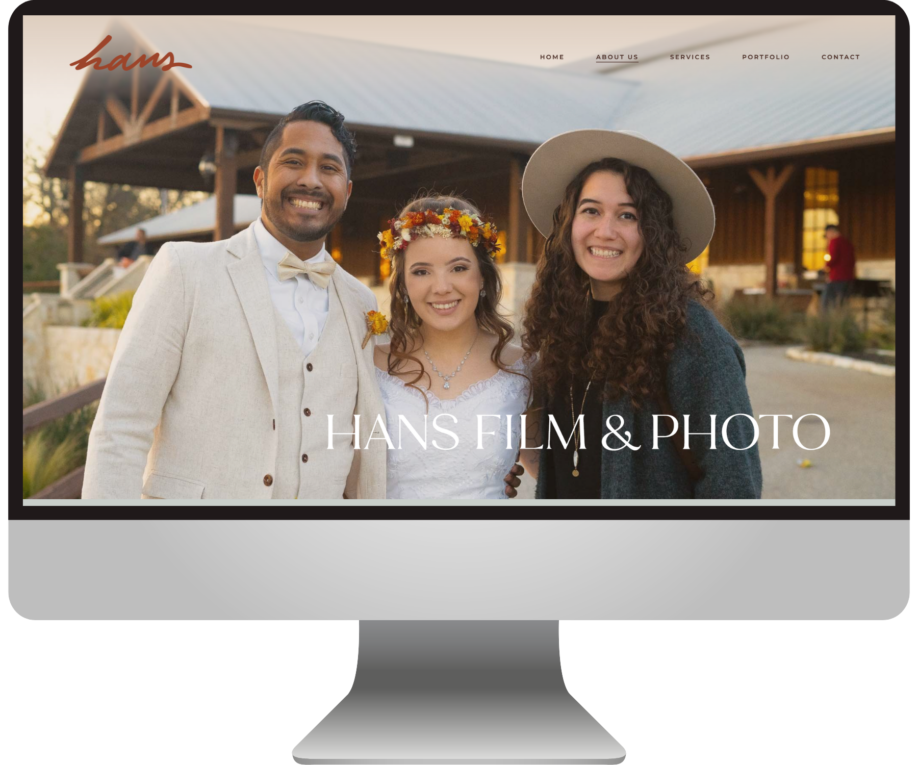
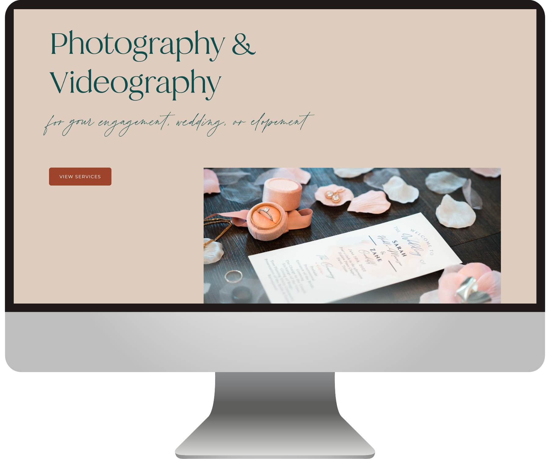
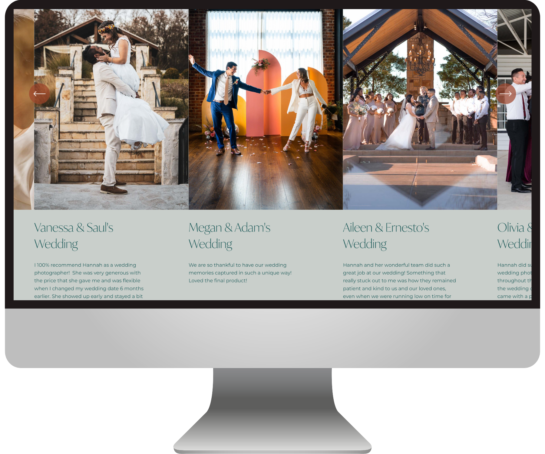
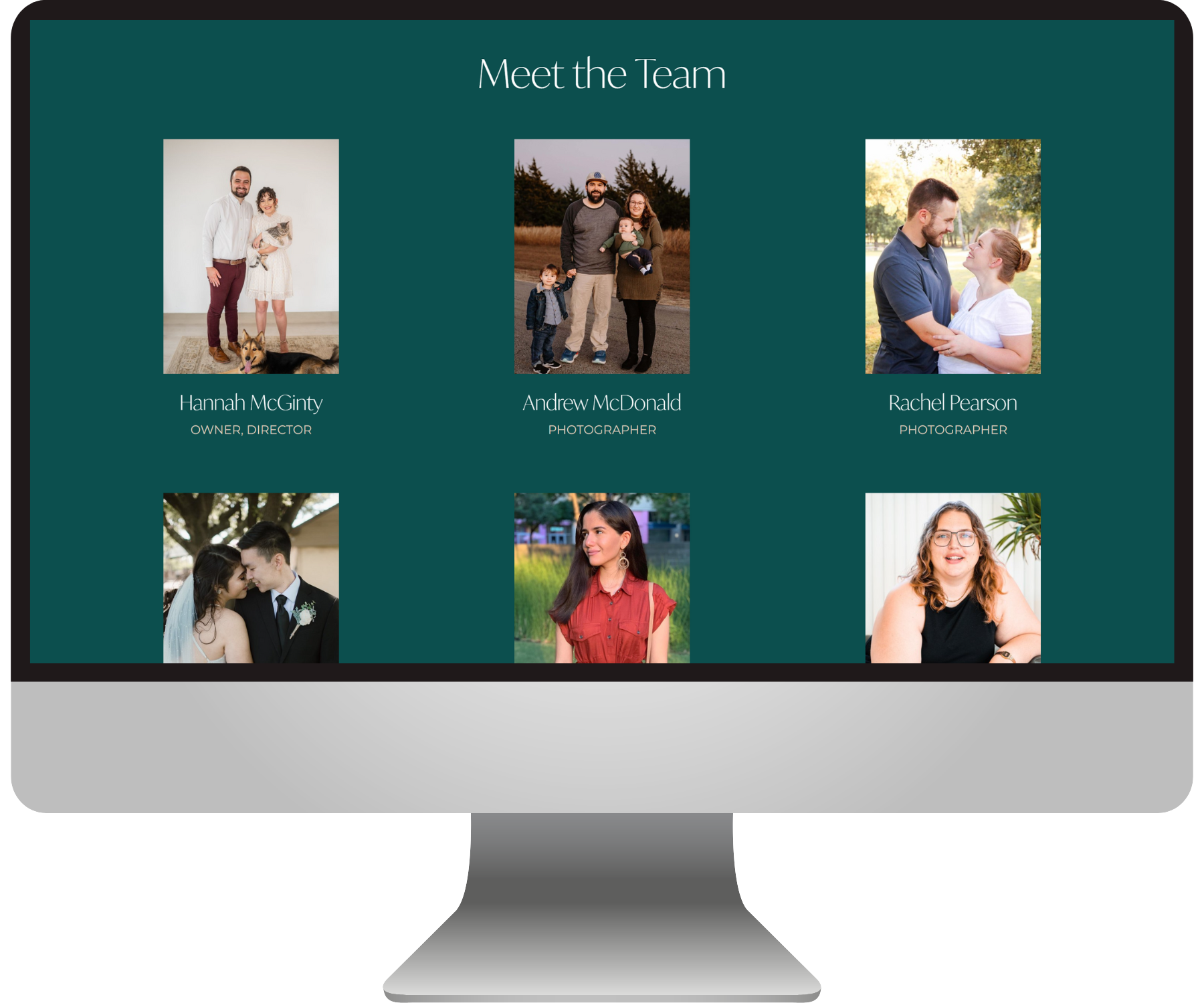
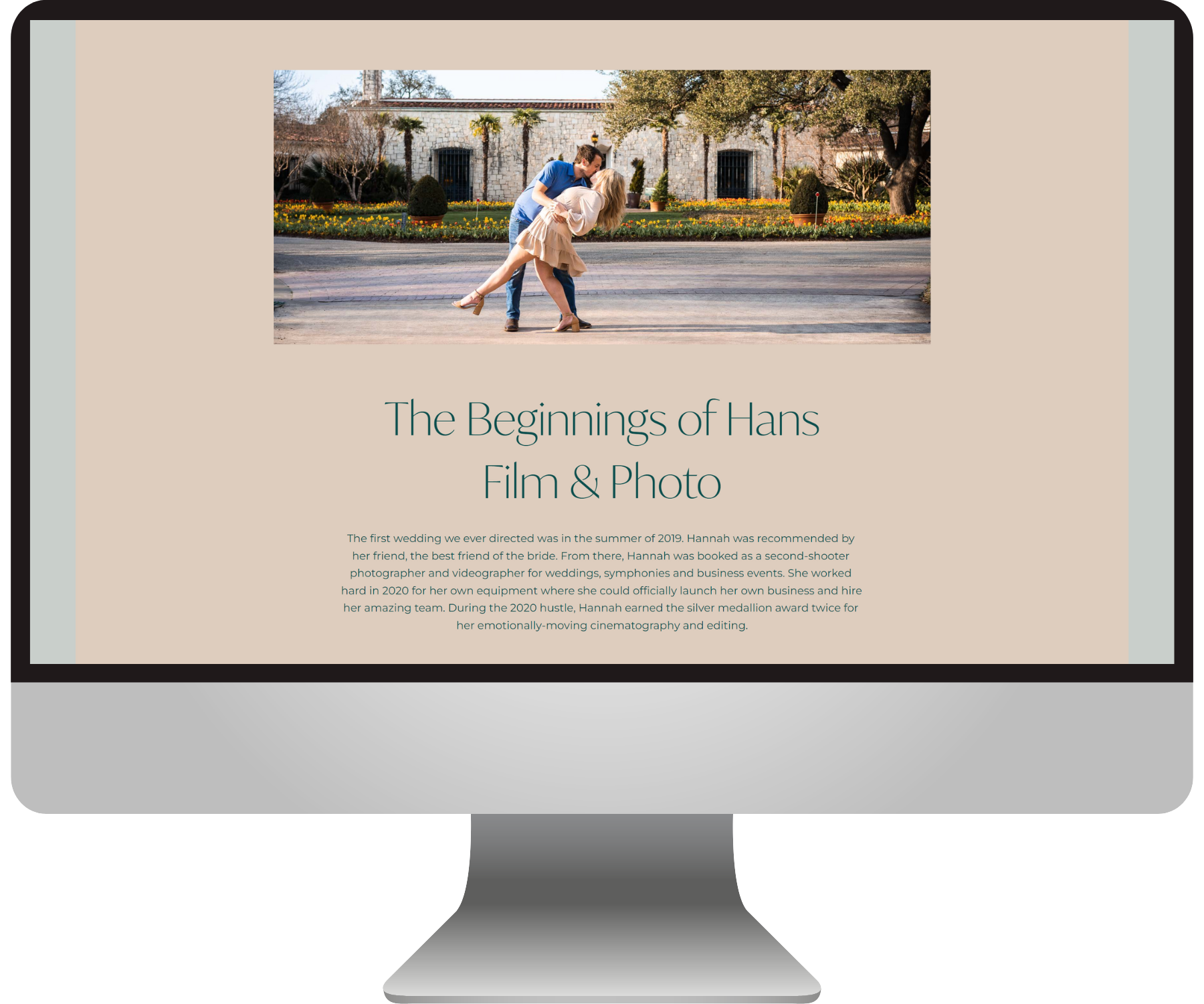
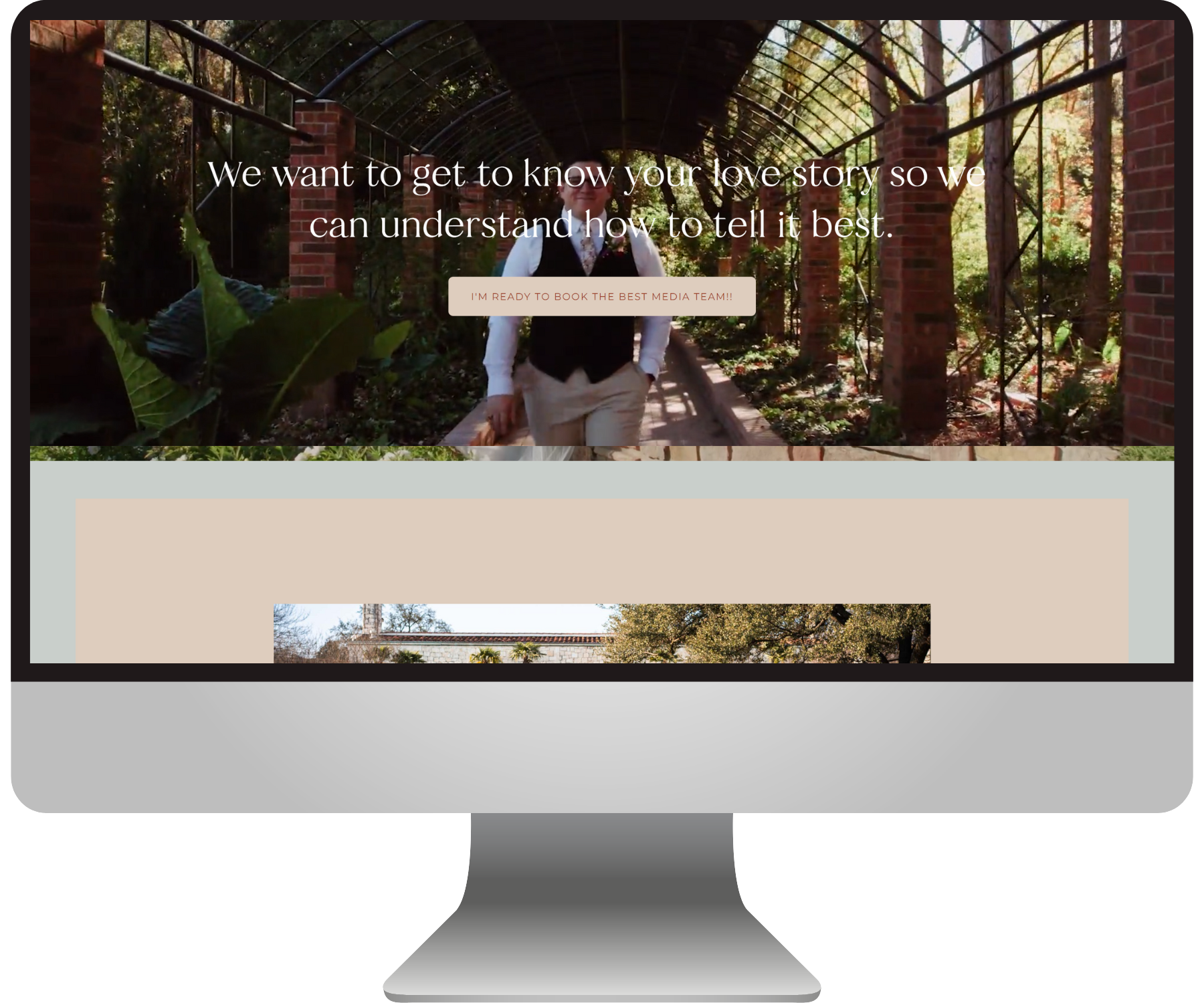
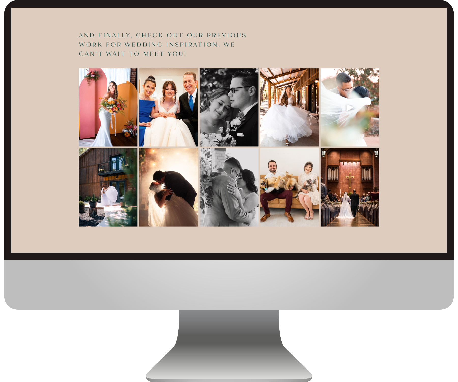
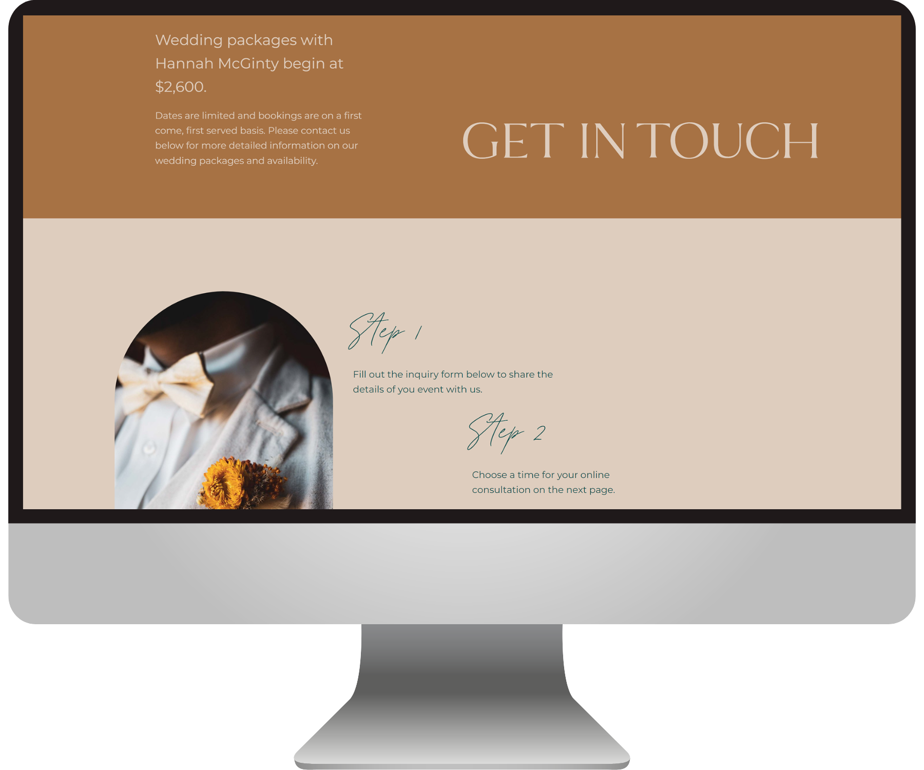
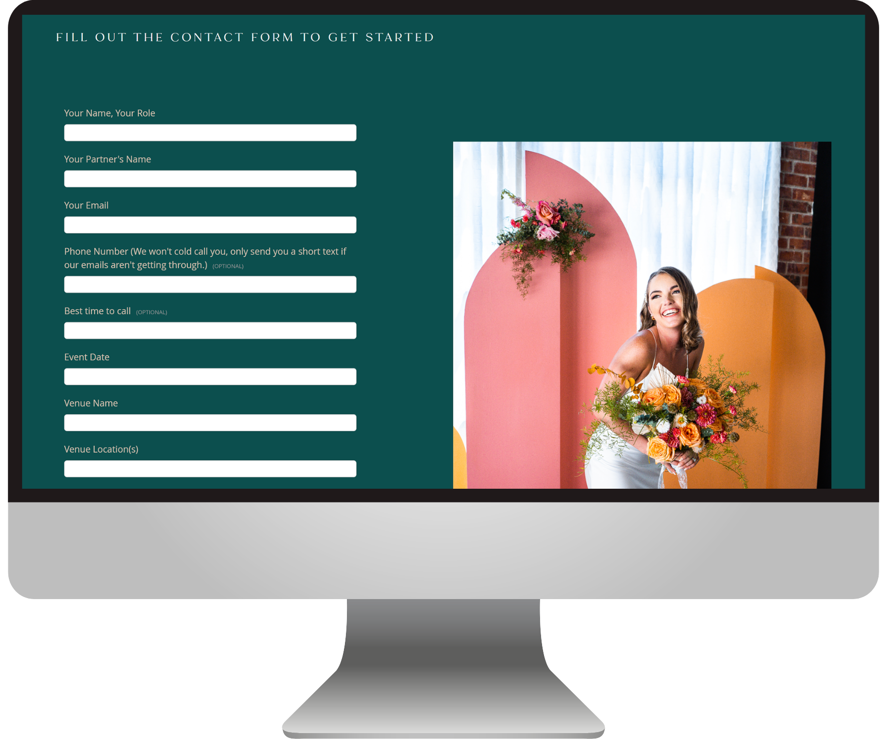
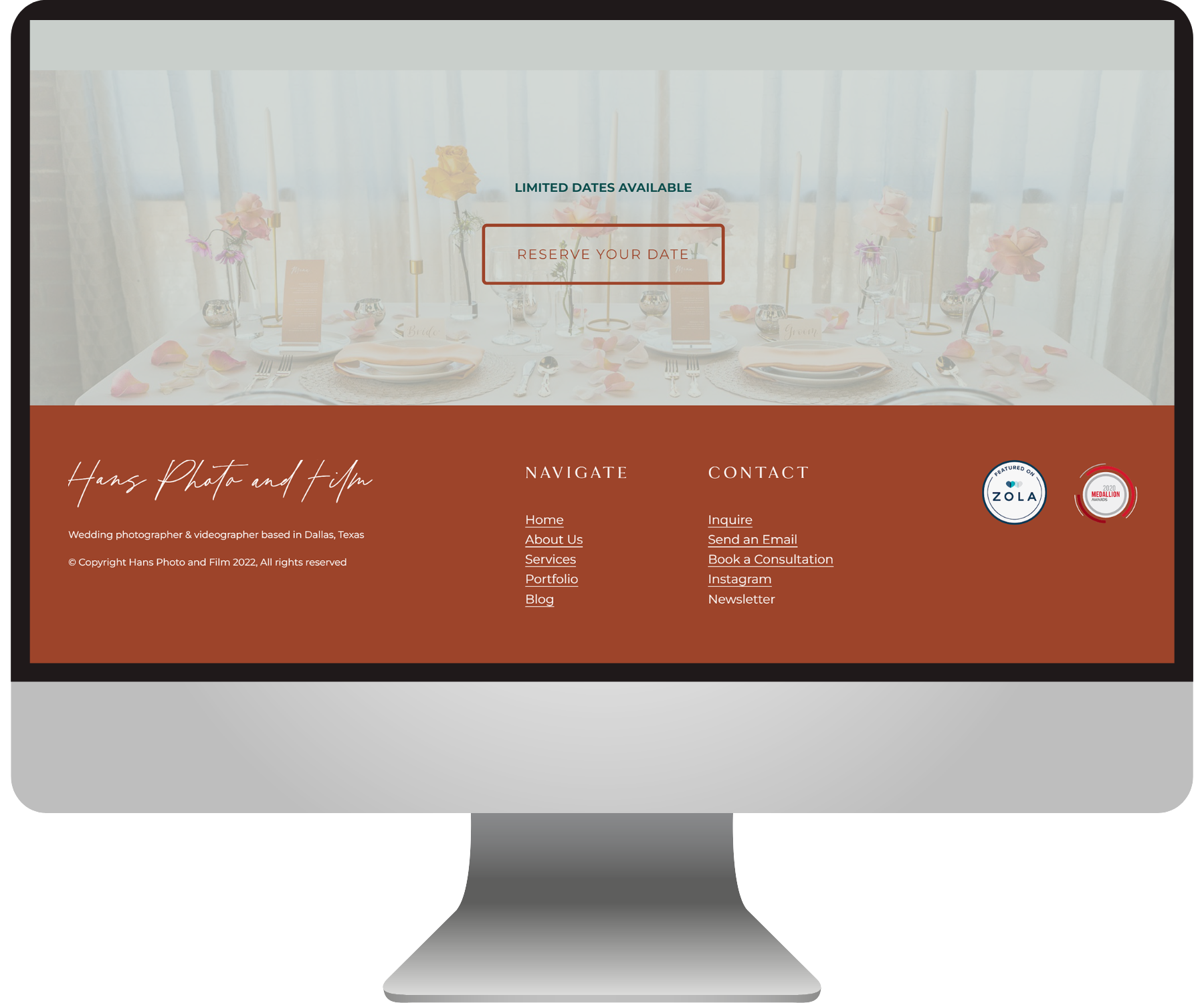
See an example here of how I reworked the design, with more close-ups below:
The Design:
An elegant-but-grounded Squarespace website
We started as always by getting clear on the website goals, the target audience, the voice, and the look & feel. Hannah had also recently had a new logo created in a rich rust color which we would base the color scheme around.
I always think it’s super important that a business’s site reflects the personalities behind it, along with the brand goals. So we used a mix of elegant fonts that would provide the luxury feel, and a range of soft and deep earth tones that totally reflect Hannah’s inviting & grounded nature. (We were both a little obsessed with that gorgeous deep green - see the pics below.)
I also utilized lots of unexpected negative space to make the site feel more “designer” (aka high-end) and added visual interest through alternating image shapes and “invisible” slideshow blocks.
And of course, we always lead with an intuitive, mobile-friendly, and conversion-driven layout :)
Overall, I think it’s safe to say we successfully increased Hans Film & Photo’s perceived value through their website design — seeing as how she started booking higher-budget clients soon after we launched!
Do you love how it turned out?!
Here’s what my lovely client said about her experience working together :)
“Now luxury brides have booked me! Hooray!
I needed a website that attracted my ideal client. I chose to work with you because your personality is beautiful and so is your design! The best thing about your service was the clear communication and efficiency.”
— Hannah McGinty
Check out more BEJ web designs here:


