Portfolio: Custom website project for a spiritual medium
The Client
Marisa Delzio, Spiritual Medium
Marisa is an absolutely LOVELY human being, who also happens to be able to communicate with those no longer with us. NBD.
She offers 1:1 and group readings (even across the interwebs!) and was hoping to add spiritual guidance coaching to her offer suite, where she teaches you how to access spiritual wisdom on your own.
But she wasn’t sure the best way to incorporate the new services, and she felt her current site design was messy and confusing. Marisa also has a blog and podcast that she wanted to feature more. I was honored when she chose me to help with this project!
The Website Strategy
A user-friendly layout
Before jumping into the web design, it was important that we first established the goals for the website and how we would meet them; so we went through a complete website strategy process.
Overall this website would need to educate people on her services and the differences between them, help them feel safe with a stranger accessing their most vulnerable connections, and give them a multitude of resources without confusing them. It was going to be a tall order; but a fun one!
After a period of consulting & research, we put together a sitemap and a content outline for each page, to guide Marisa on giving her audience all the necessary information in a user-friendly format.
This included a complete sales page for each different type of service, a fully-fleshed-out landing page for the podcast, an in-depth About page so clients could feel comfortable with Marisa, and of course: a fabulous Home page to sum up the business as a whole!
Then it was onto the design!
The Website Design
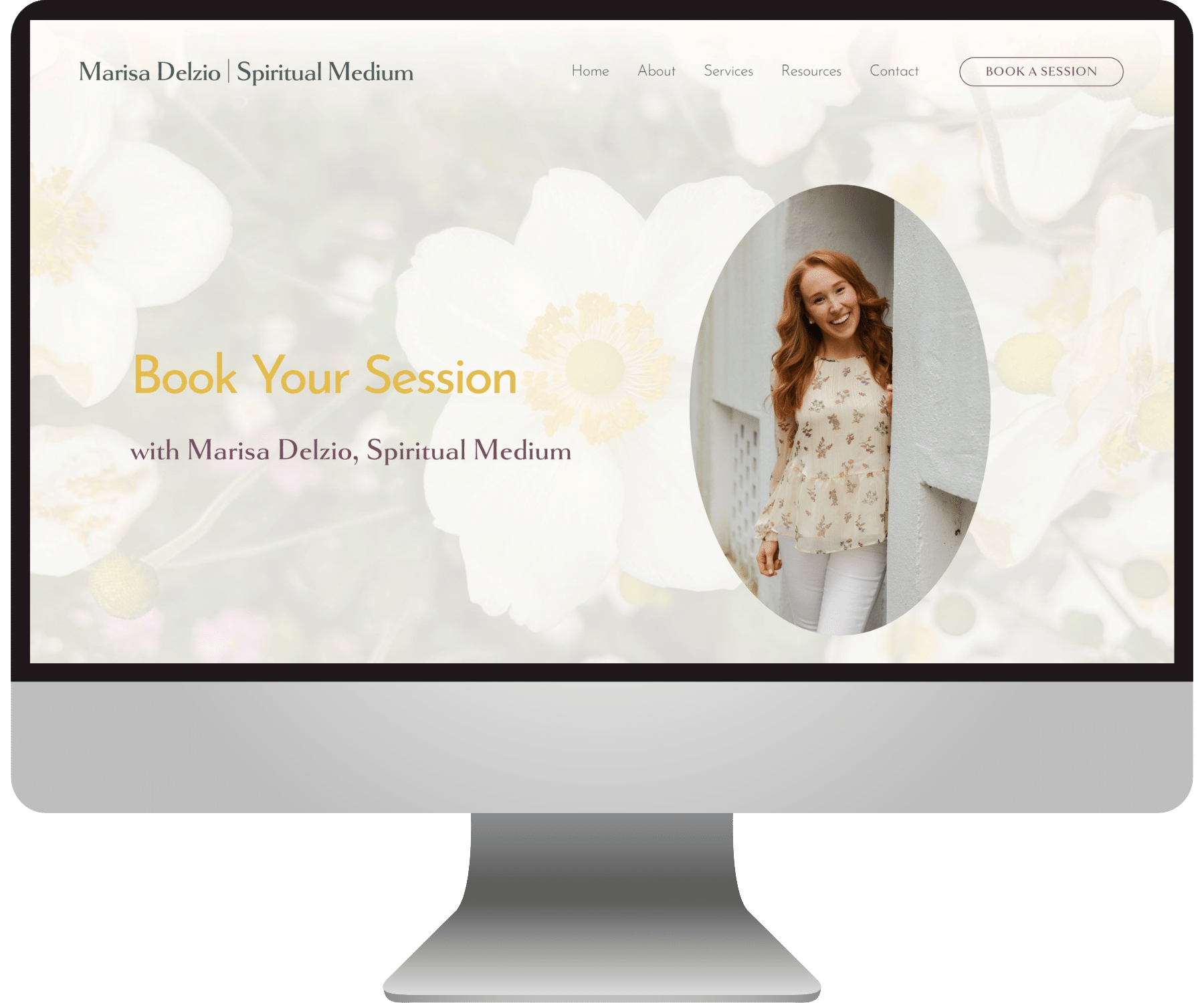
A soft & serene Squarespace site
Words such as “comfortable”, “safe”, “warm”, and “gentle” came up over and over again in Marisa’s client testimonials — so we definitely wanted this to be reflected in the color scheme.
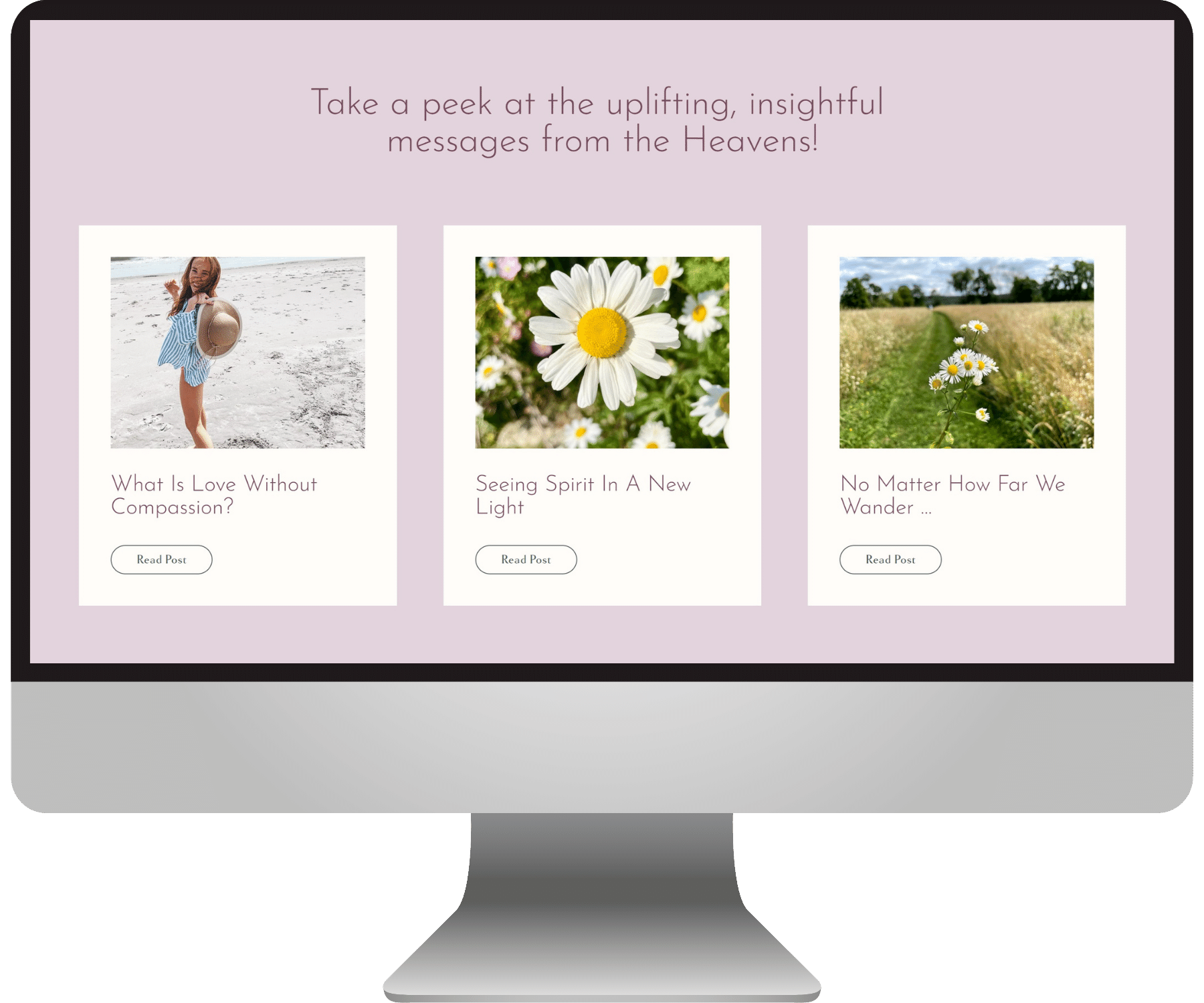
Marisa is also all about connecting with nature and the heavens, so there are themes of sky, trees, flowers, butterflies, and water throughout the imagery.
Although many people utilize a medium’s services in order to heal from grieving, we didn’t want this website to feel sad. We also didn’t want to “invoke the dead” and make it spooky. Instead we wanted the website experience to be light, uplifting, and joyful — just like Marisa’s personality!
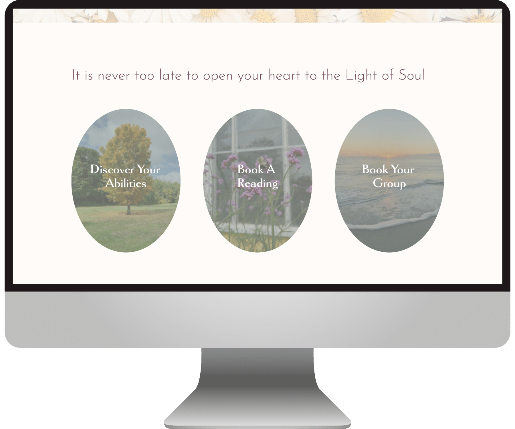
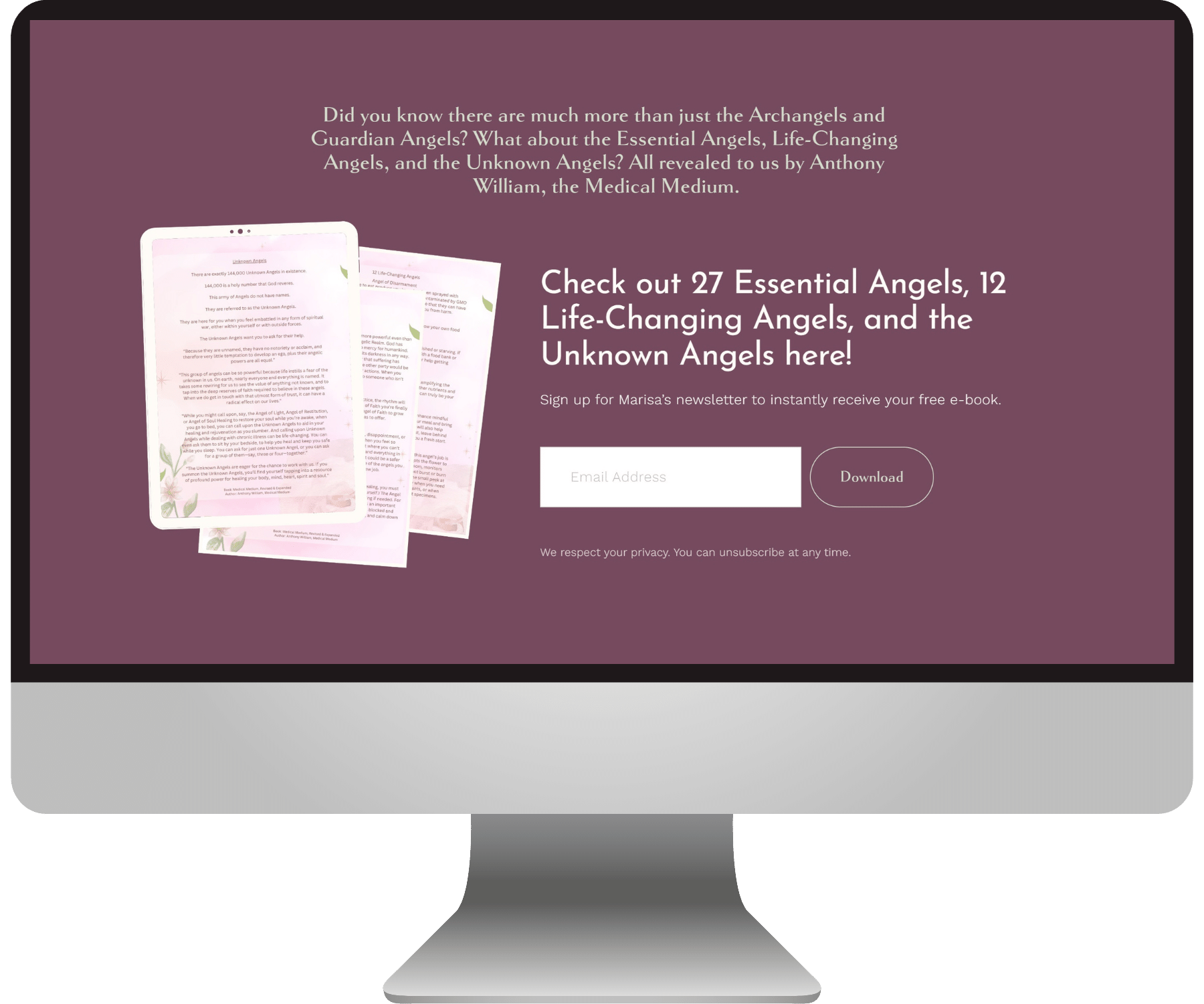
With all that in mind, we went with an airy and serene design scheme; using a bright warm off-white, soft orchid & greenery, and a sunny yellow accent.
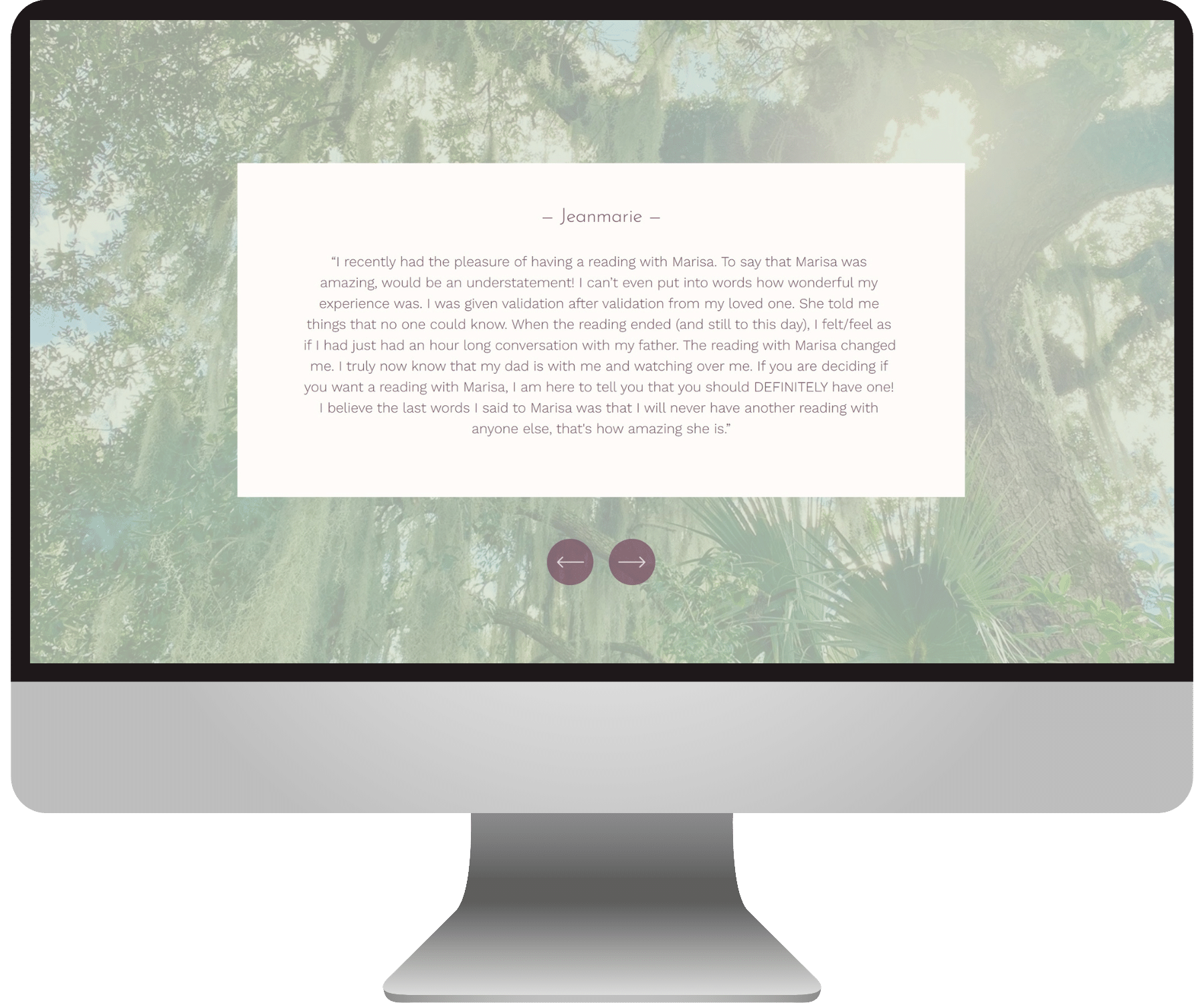
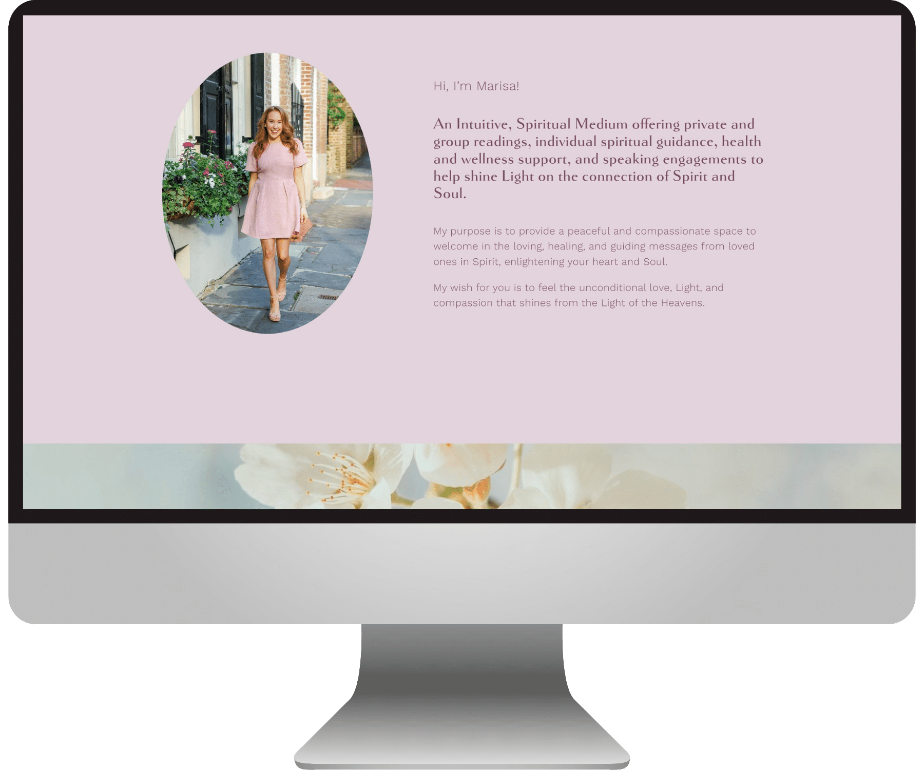
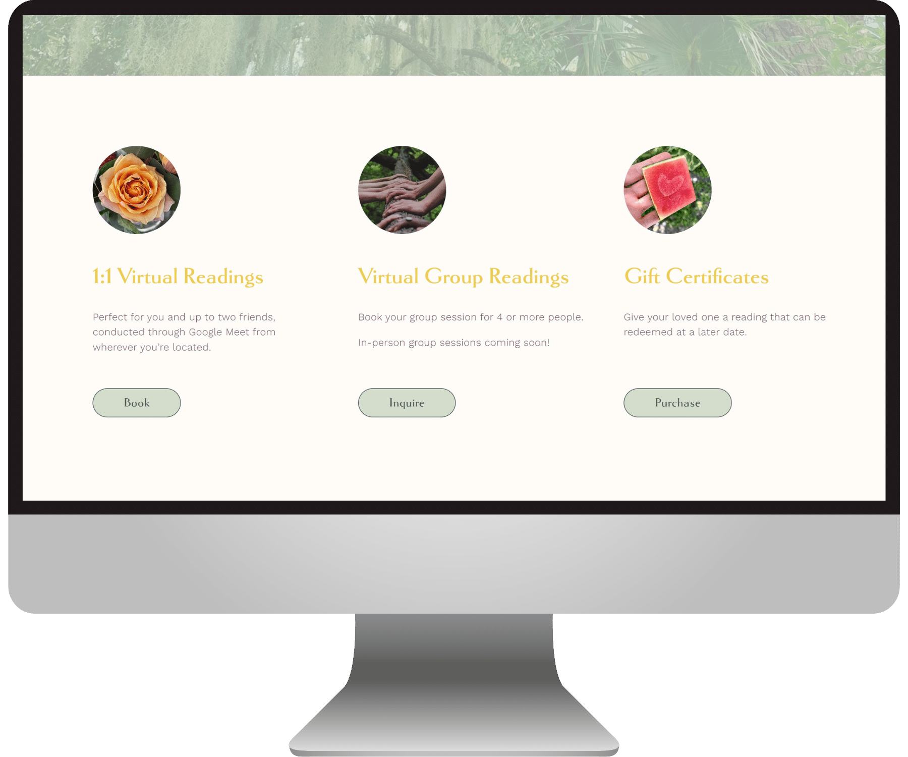
See some close-ups below!
Here’s what my lovely client said about her experience working together :)
“Along with bringing your creative visions to life through her talented expertise, Emily will help transform your business to much bigger and brighter days!
Because of you I was able to add additional services that had only existed as ideas before + increased traffic, income, and many, many compliments which feels like an added bonus!
From the very first time we communicated, you made me feel like you cared just as much about bringing my visions to life as I did!! That means so much to me!! I cannot thank you enough :)”
— Marisa Delzio
Check out more BEJ web designs here:


