welcome to the BEJ blog!
here we dive deep into all things website strategy & design tips for wedding pros.
Take the Quiz:
What’s holding your website back?
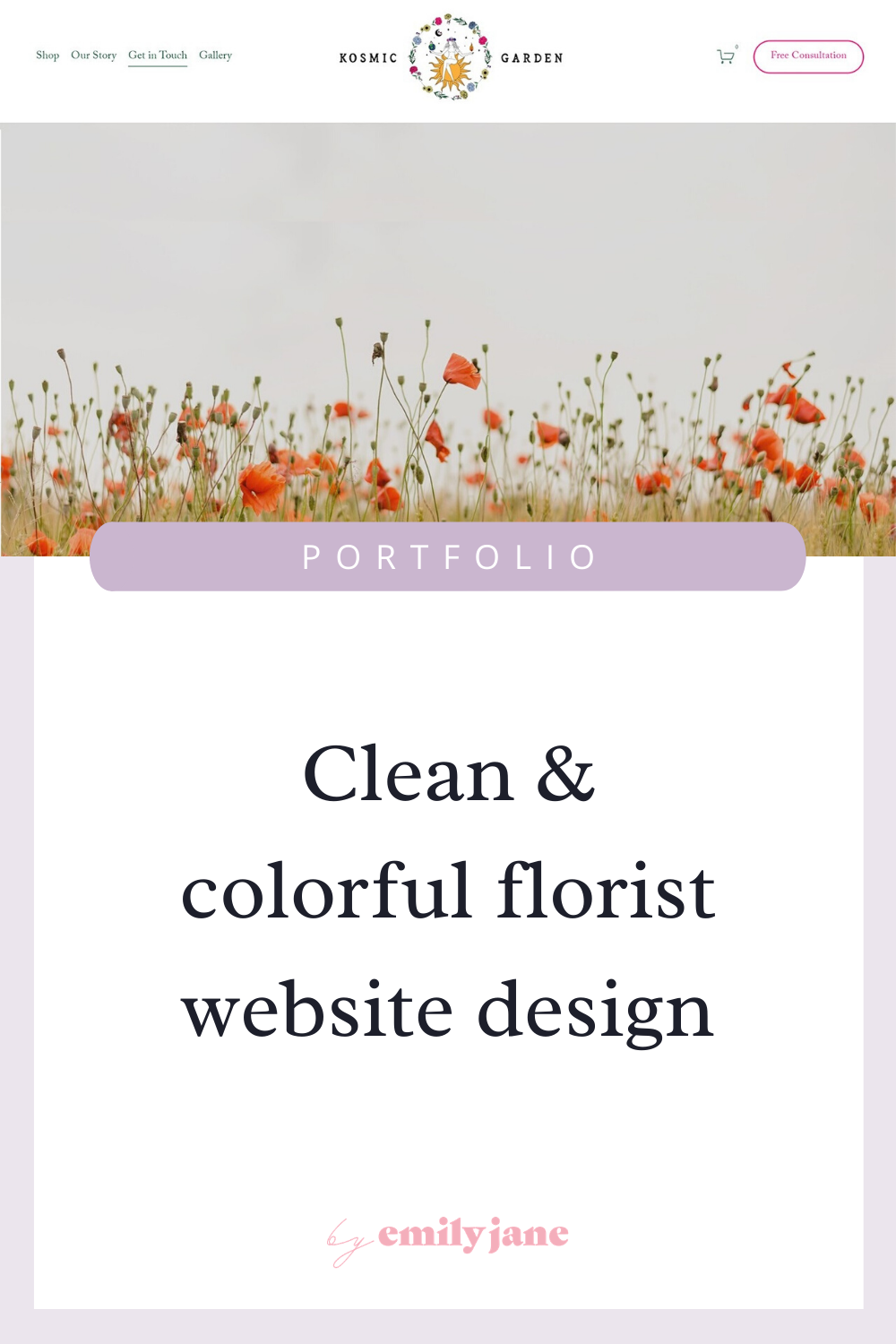
Portfolio: Feminine Squarespace web design for a florist
How to change the Squarespace line block’s color and width in versions 7.0 & 7.1, video tutorial
Normally if you want to change how long a Squarespace line block appears on your page, you’d have to add a spacer block next to it and drag it over. I recently found myself working on a client website where I wanted all the lines to be the same width (or length depending on how you see things, haha). I wanted all the lines on the website to take up about 75% of the typical allotted space. So I used the simple code hack below to make this adjustment! Additionally, it’s kind of annoying that in the older versions of Squarespace, you can only have a black line… or a white line. The end. But sometimes, I want the lines to be an element of the color scheme, with a minimal pop of color. Other times, I want all the lines in the design to be subtle and fade into the background. This code will solve that for you too!
3 Ways to declutter your website design
How to get a full-screen video header in Squarespace
If you’re looking for a way to make your header a full-screen video, look no further!
Squarespace Personal vs. Business plan - features & pricing comparison (updated for 2023)
So you’ve decided on Squarespace, because it’s the best all-in-one platform for your website. But you’re not sure whether to choose the Personal or Business plan? Let’s dive into it, and make it super clear for you 🙂 For many, many people the Personal plan is more than sufficient for a beautiful functioning website with great SEO, mobile responsiveness, a blog, and some coding capabilities. I’ll just walk through all the common scenarios in which you would need the Business plan’s premium features. And the great thing is, you can upgrade your plan at any time if your business’s needs grow!

How I dealt with chronic pain by starting my own business
Up till now, I’ve kept the focus of my blog on helping small biz owners create better websites and in turn, increase the perceived value of their businesses. But I think it’s time I give a little background on who I am and what drives me.
I want you to know why this blog and this business means so incredibly much to me. And perhaps, just maybe, there’s a chance it’ll inspire someone in some cool way.
In early 2019 I started doing website design and development inside of Squarespace. But let’s back up a bit. Like a LOT bit. I want to share what led me to this point.
Because I didn’t go to school for design, or anything computers-related for that matter. In fact, I never even thought I could or would want to get into this industry until 2018. But that just goes to show how bad we are at predicting our futures, and how quick we are to falsely label the limits of our abilities.
15 Stunning wedding vendor websites built on Squarespace
How to get a full-screen slideshow at the top of your Squarespace page
If you’re looking for a way to make your header a rotating set of images, you’re in the right place!

The #1 way to keep people on your website (a factor that many top designers ignore)
How to separate images in a carousel or slideshow in Squarespace (7.0 & 7.1) video tutorial
A common way of showcasing photos is by using Squarespace’s carousel gallery block (or the new slideshow reel in 7.1). But this forces your photos right up next to each other, which can sometimes look crowded or confusing. So to let the photos breathe and pop more, I came up with a CSS solution that can be tweaked to your liking. Here are some before and after shots!
Look more pro with these 8 settings in Squarespace (fast fixes)
5 Steps for seeing more progress in your business
I have a repeatable 5-step process that has been HUGELY instrumental in shifting my mindset from unable to unstoppable. I need to say something about these steps, though: They seem so simple that most of us don’t bother doing them. But the impact they have on our mental state is actually game-changing. So I challenge you to go deep in understanding the psychology behind them, practice them in your work, and feel the immediate difference it makes.
How to make your header transparent in both versions of Squarespace
Depending on which template you start with in Squarespace; your logo, navigation menu, and other elements may have a solid background color; or they may sit right on top of a photo. If you want to switch up these style settings, here’s where you can find them!
Alternatives to the blog sidebar feature in Squarespace 7.1
One downside of the new version of Squarespace, at least for the time being, is that you don’t have the option to create a blog sidebar.
Photoshop tutorial: How to make a website banner out of a small photo
Squarespace makes it really easy to create hero/header/banner images with headlines on top. The problem is - many of us don’t have a bunch of wide-shot, landscape-orientation pictures with plenty of negative space to work with. You can totally repurpose your close-cropped and even vertical pictures that you love, and put them to use for your banners!
