Portfolio: Squarespace website for a rock band with a retro twist
about the strayhearts
Upbeat acoustic rockers from the Alamo City.
Monaco and the Strayhearts is a band straight outta my home state, Texas. So it was super cool to connect with them online and serve them through web design!
They have crafted a completely unique sound, consisting of a mix of Latin rock, pop, country, and vintage rock n’ roll. I mean… definitely sounds like a Texas concoction.
Basically, they’ve mastered their high-energy stage presence and needed an online presence to match.
the requests
Some of their main asks were:
The Strayhearts were going through a re-branding and were transitioning their sound and their look from dark and gritty to sunny and lively.
Mark envisioned a clean and simple website (my favorite kind!) with no fuss, that riffed off the playfulness of their brand new logo and promo photos, which amplified the 1960s vibe of their roots. The aim was to move away from deep country and more towards vintage rock n’ roll.
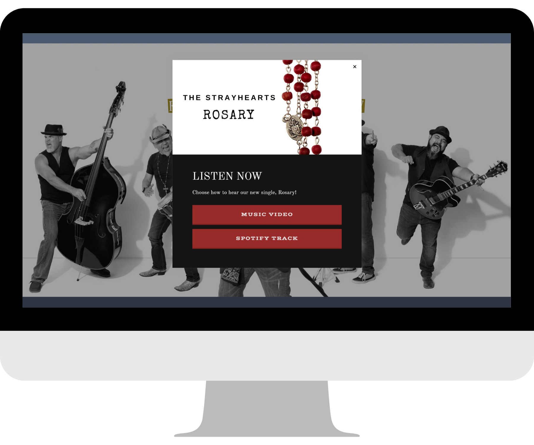
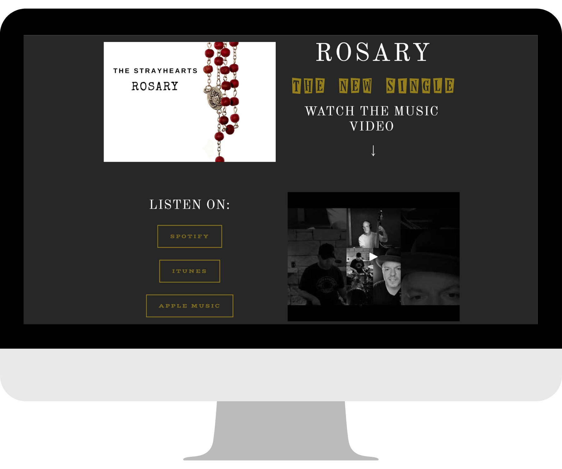
They also needed to highlight their new single in multiple places, allowing fans to instantly stream the song or watch the music video.
Flip through the slideshow below to see how we made their vision come to life!
the design
We started with the Horizon template on SQSP 7.0.
It provides all the essentials for bands, like a tour date calendar and ticket purchasing.
But this moody color scheme is NOT what we were going for.
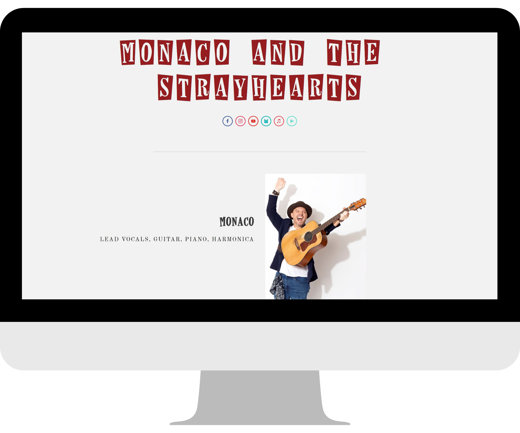
One of the first changes we made was to flip this site onto a clean white background with tasteful pops of color sprinkled in. Every time you scroll into a new section of the page, it’s a fun surprise. I wanted the viewer’s experience to be as exciting as the band’s live shows!
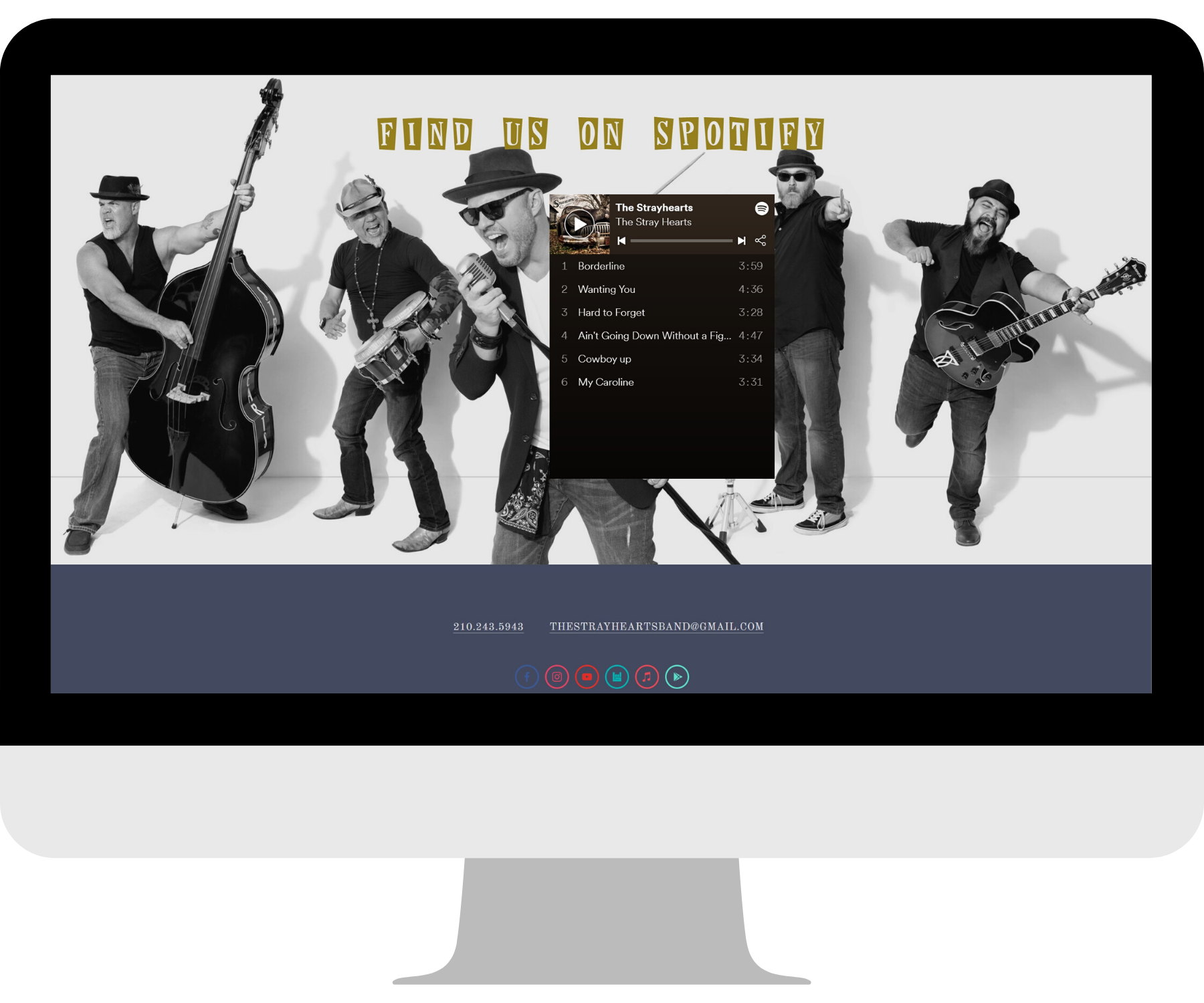
Off the bat, the full-bleed band photo at the top of the home page packs an energetic punch.
As you navigate the site, you’ll see touches of the burnt red and mustard from the logo injected into various sections. To round out the color scheme, we used a soft blue to play off the navy of the band’s clothes.
The featured song section of the home page is highlighted using a contrasting dark background. The music video plays in a pop-up without having to leave the website!
To reflect The Strayhearts’ eclectic mix of sound influences, we used variations of the vintage decorative font from the logo throughout the site, along with an old western-style font, and a more neutral font for some stability.
Other neat features include a pop-up advertising their new single, a Spotify playlist widget, and a newsletter signup!
one happy client
I’m pumped that The Strayhearts were thrilled with their site!
Here’s what they had to say about the experience:
“Emily was just what we needed! She executed our Squarespace website revamp quickly and was extremely thorough in getting the style and design elements just right. We will definitely be rehiring her for all our future projects.”
- Mark, The Strayhearts


