Portfolio: Vintage-inspired website design for a slow fashion company with French & Vietnamese roots
The problem
Caroline came to me looking for a website to showcase her handmade dresses and gather feedback from her community. She’d started building the site in Squarespace but realized the project was much bigger than she anticipated. A tale I’ve heard many a time, and understandably so!
She was FULL of ideas for the design direction, but wasn’t quite sure how to narrow them down and create a unified vision. Here’s what we knew for sure: The design needed to reflect a blend of Vietnamese and French influences, while also communicating the vintage style that inspired the dresses.
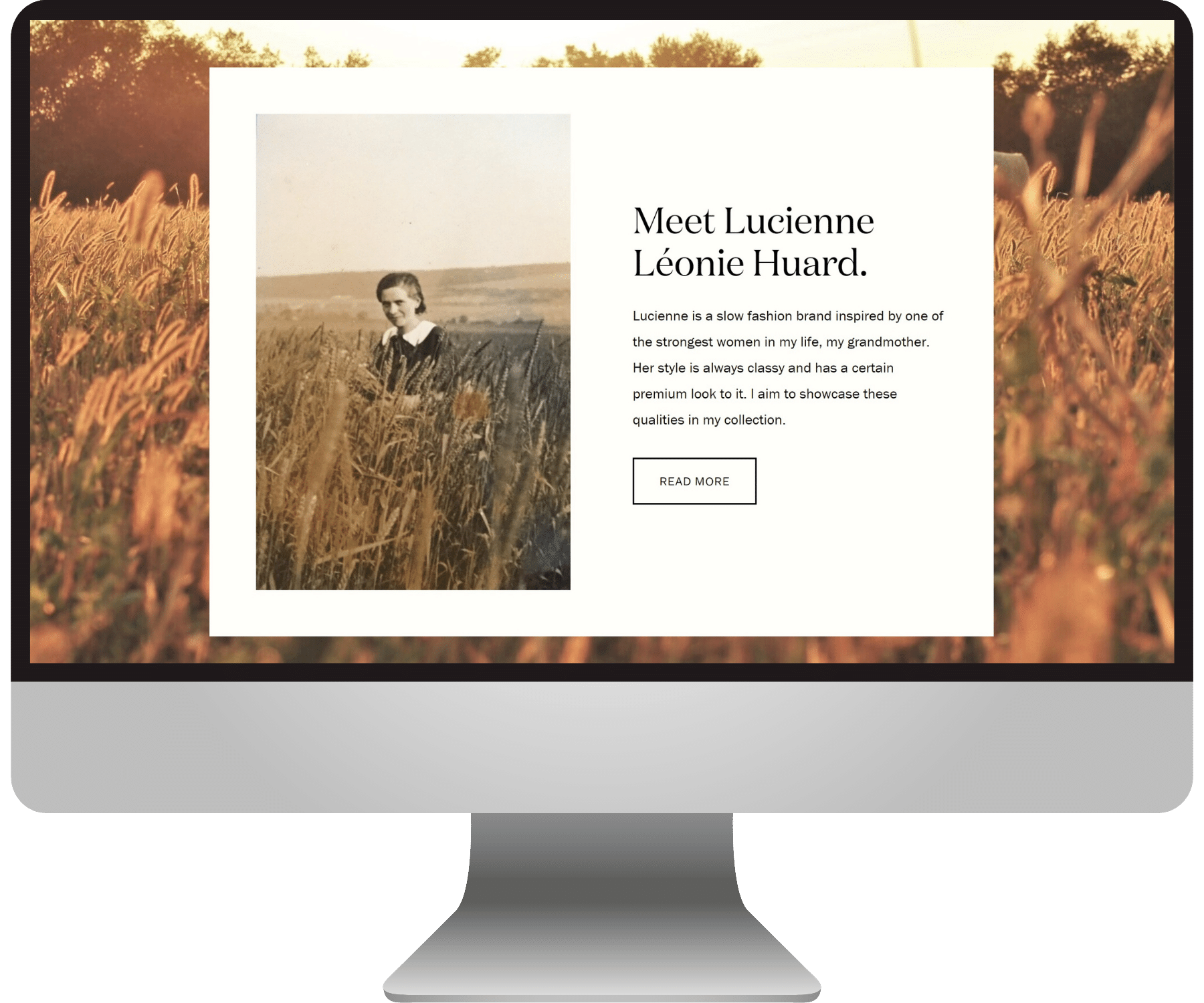
What’s so cool about Caroline’s brand, Lucienne, is that the whole thing stems from her grandmother, who used to make all her dresses herself. Caroline is carrying on this legacy, using her grandmother’s French heritage and her photos from her travels in Vietnam as her guide!
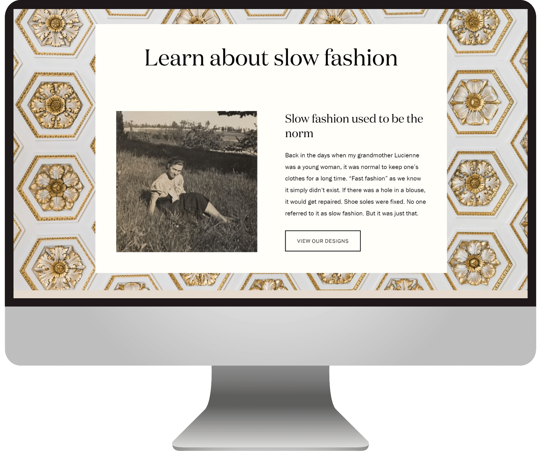
She designs her dresses to be very old-fashioned and long-lasting — a movement towards sustainability in the fashion world. We definitely wanted all these values and influences to be incorporated into the website design direction.
After consulting more with Caroline, here’s what we narrowed the mood board down to:
The solution
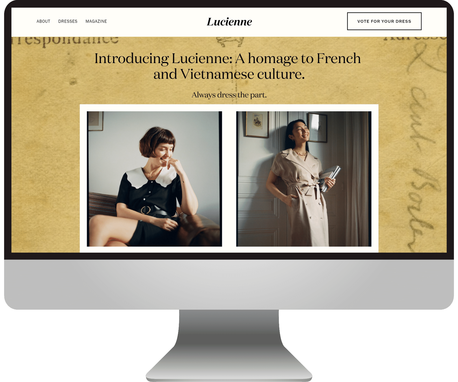
A luxurious gold inspired by Vietnamese culture and shades of beige help the Lucienne brand feel aged but high quality. The fonts we chose reflect the dress designs: timeless staples with an air of femininity.
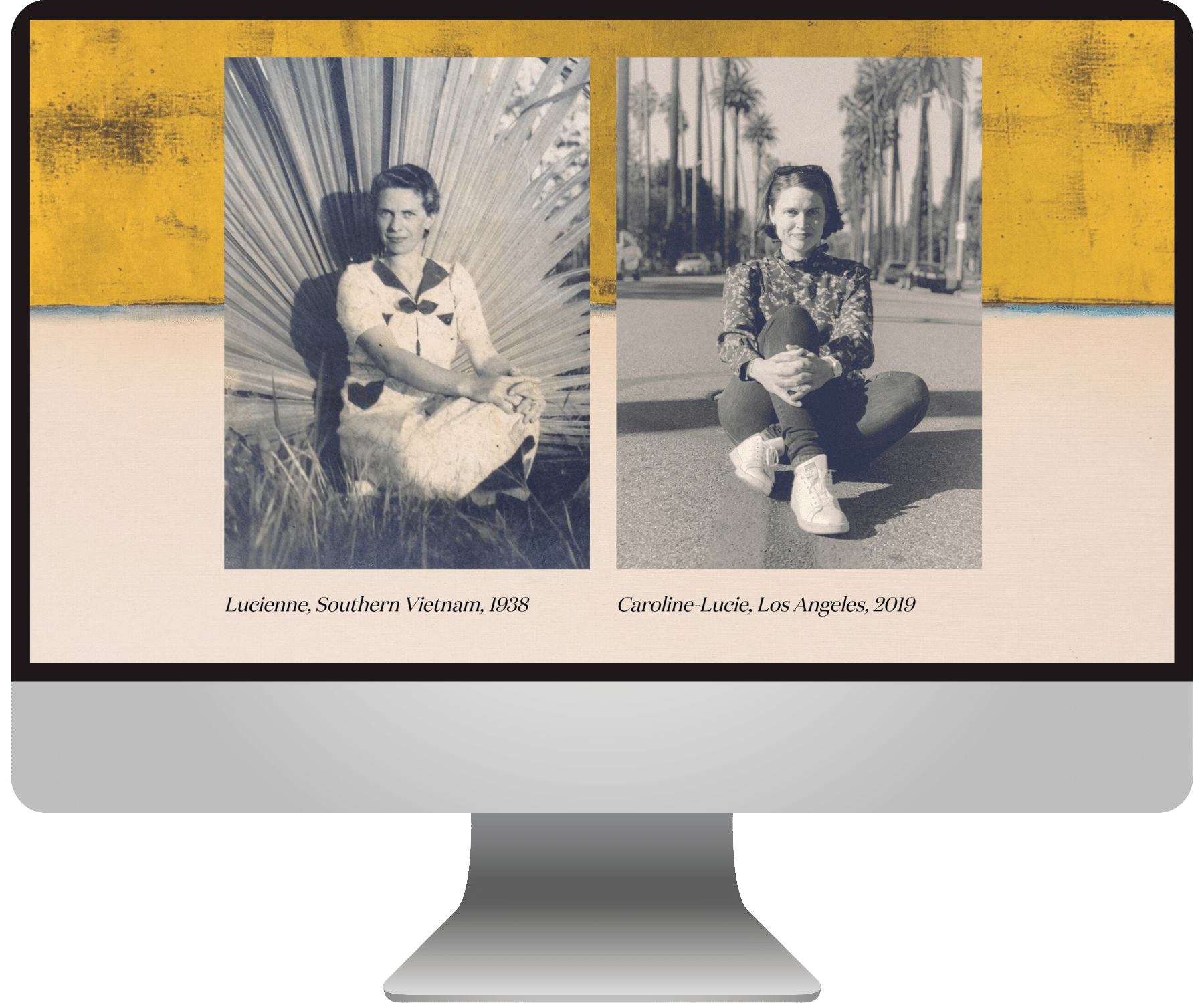
We used lots of old photos of Caroline’s grandmother throughout the site. I even got to bust out some of my photo-editing skills from my days as a photographer to match the style of the vintage snapshots! (See slideshow below.)
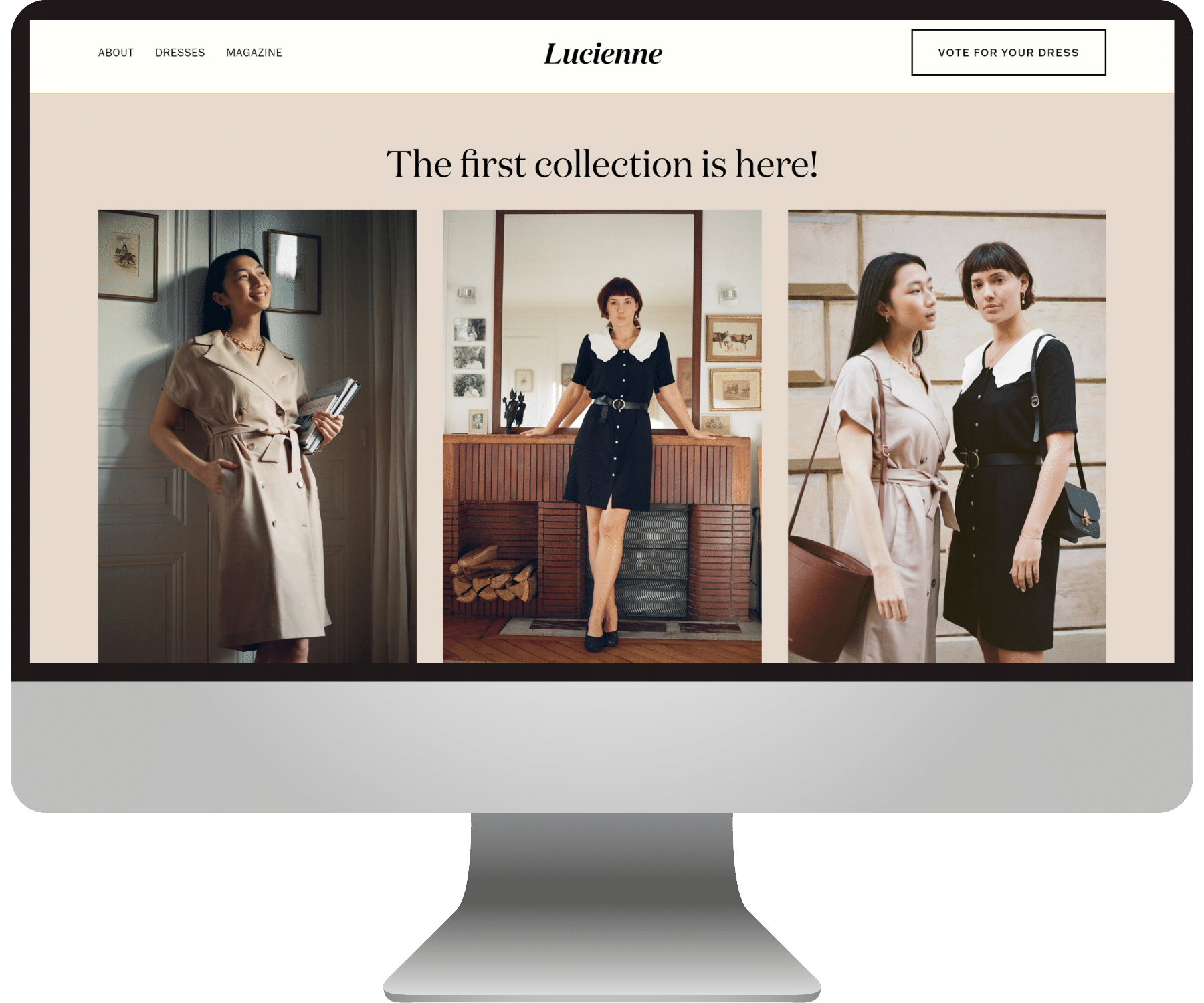
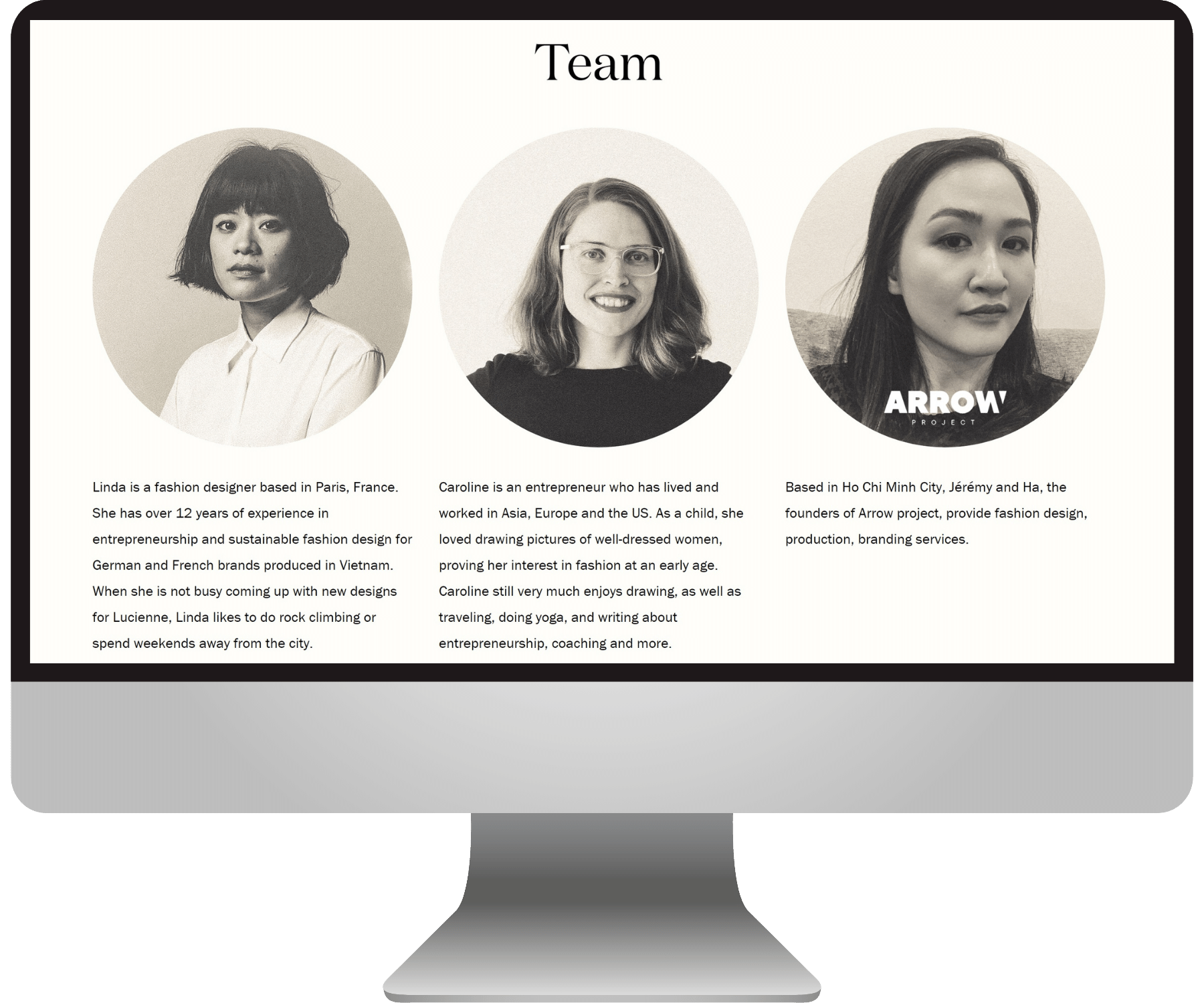
We kept a clean and organized navigation, and let the work shine. The rich history behind this company and its values are also communicated in different ways on every page of the site.
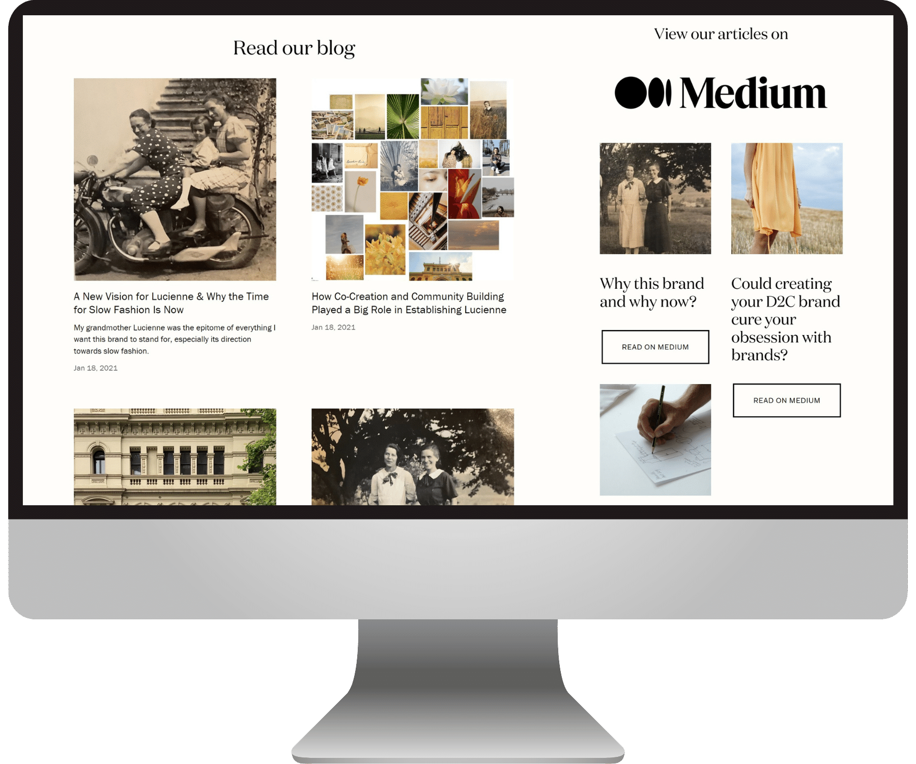
We also created a blog page for Caroline to share stories and news about her work and the world of sustainable clothing, and made sure the main CTA on the site drove people toward Caroline’s goal of getting feedback from her site visitors.
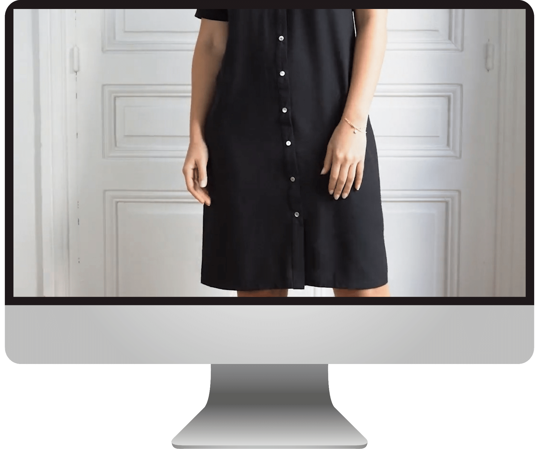
Check out some stills of the website below. What do you think?
Here’s what my lovely client said about her experience working together :)
“Emily comes up with beautiful and creative solutions.
I highly recommend working with Emily as she is very well organized, has great ideas and her conceptual website design work is fantastic. She also excels at challenging you to refine your brand's identity. I very much enjoyed cooperating with Emily and would do so again anytime.”
— Caroline Lucie-Ulbrich, Lucienne
Check out more EJ web designs here:


