Portfolio: Soft teal & gold website design for a luxury wedding planner
An evolving brand in need of a website overhaul…
You may remember the starter website we created for wedding planning company, Classic & Curated (back in our first year of business. Woo! What a journey!). Well since then, Classic & Curated underwent a rebrand and is now Rachel Willis Events!
This wedding planner is all growed up, “post-panorama” — and she needed a brand and website to be elevated to reflect her raised prices and growing, specialized skillset. She wanted to make sure that the luxury clientele she’s found herself working with feel at home with her business.
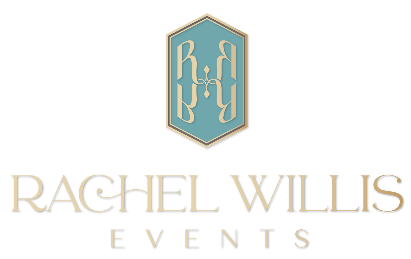
Check out the exquisite brand identity the amazing Ceci New York designed for Rachel, below:
The new Squarespace website
The problem is that sometimes, even with beautiful branding, it can be really tricky to figure out how to create a clean, visually-balanced design. In Rachel’s words: she was worried her application of the new brand colors might look too much like My Little Pony. :P
So she came back to By Emily Jane for a complete website design update; and I’m so grateful! We tried to strike an elegant-yet-whimsical balance with the use of the varying shades of teal, to mirror Rachel’s wedding design style.
We left the pinks to her imagery, since it was a secondary accent color, and there’s just a touch of gold here and there to tie in the logo.
Take a look see!
About a month after her website makeover, Rachel started seeing amazing results!
“I have had a crazy number of inquiries come in and I just about have a full calendar! I have to attribute it to your dedication to making my website look bomb. I am finally starting to get the results I was wanting.”
— Rachel Willis, event planner


